Submitted over 3 years ago
Mobile first approach using node SASS, Flexbox and parcel-bundler
@SaifN97
Design comparison
SolutionDesign
Solution retrospective
I'd love some feedbacks :)
Community feedback
- @Naimul11Posted over 3 years ago
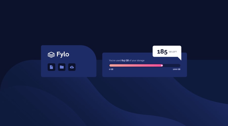
you did very well. But there have some issue. It's not responsive. In mobile view you can use max-width. and you can use px or rem/em for the icons. because in small screen it's look terrible.
0@SaifN97Posted over 3 years agoThanks @Naimul11! I think the icons break on tablets around 700px and its looks pretty decent on mobile screens still but thanks for the heads up!
0@Naimul11Posted over 3 years ago@SaifN97 In laptop(1024px) the icon is so small that it hard to see.
0@Naimul11Posted over 3 years ago@SaifN97 Oh! sorry. Not the fylo icon. i meant file/document icon
0
Please log in to post a comment
Log in with GitHubJoin our Discord community
Join thousands of Frontend Mentor community members taking the challenges, sharing resources, helping each other, and chatting about all things front-end!
Join our Discord
