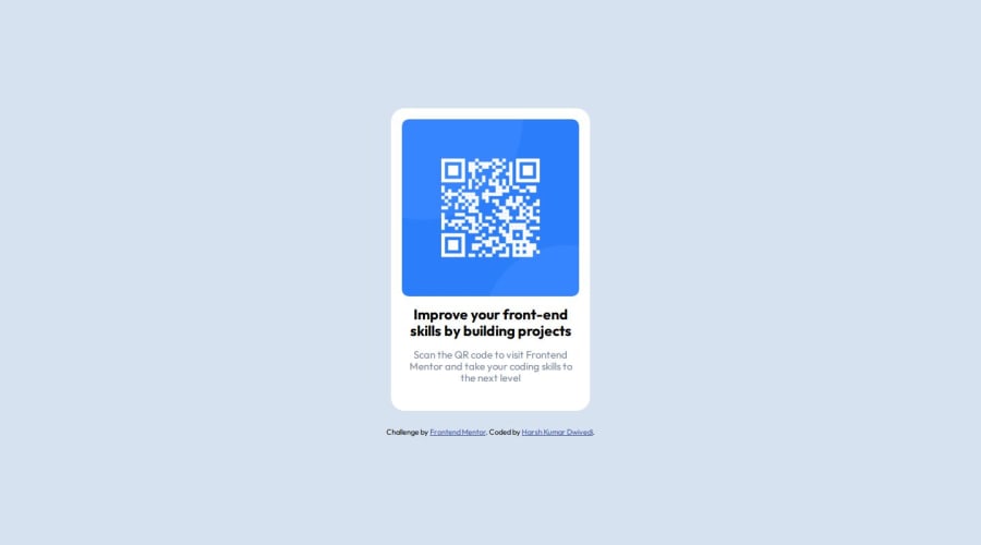
Mobile First Approach using Flexbox
Design comparison
Solution retrospective
What could be another concise approach to develop this project?
Community feedback
- P@danielmrz-devPosted about 1 year ago
Hello @Harsh-Kumar-Dwivedi!
Your solution looks excellent!
I have just one suggestion:
- Use
<main>to wrap the main content instead of<article>.
📌 The tag
<article>would make more sense if the card was part of a bigger website (in certainly would in real world), but here it is all we have on the screen.This tag change does not impact your project visually and makes your HTML code more semantic, improving SEO optimization as well as the accessibility of your project.
I hope it helps!
Other than that, great job!
Marked as helpful0@Harsh-Kumar-DwivediPosted about 1 year agoHello @danielmrz-dev !
Thanks for your feedback.
Just wanted to ask, what improving accessibility of project truly means?
0 - Use
Please log in to post a comment
Log in with GitHubJoin our Discord community
Join thousands of Frontend Mentor community members taking the challenges, sharing resources, helping each other, and chatting about all things front-end!
Join our Discord
