Not Found
Not Found
Not Found
Not Found
Not Found
Not Found
Not Found
Not Found
Not Found
Not Found
Not Found
Not Found
Not Found
Not Found
Not Found
Not Found
Not Found
Not Found
Not Found
Not Found

Submitted

Mobile First Approach using Flex and relative units.

weixin 50

@twx0504

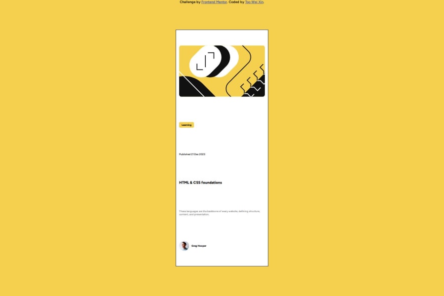
Desktop design screenshot for the Blog preview card coding challenge

This is a solution for...

  • HTML
  • CSS
1newbie
View challenge

Design comparison


SolutionDesign

Solution retrospective


  1. What did you find difficult while building the project? As a beginner, I found styling with CSS to be particularly challenging, especially when certain styles did not render as expected. For instance, achieving horizontal or vertical centering of elements proved difficult, leading me to experiment with various solutions found on platforms like YouTube.Working on responsive design poses a challenge when resizing the screen using dev tools, as maintaining the design's integrity becomes difficult. It tends to deform and look ugly.
  2. I am uncertain about specifying width and height in my project. I struggle with deciding when to set them and which units to use—whether in pixels, rems, percentages, or viewport units. In some instances, modifying these properties produced the desired changes, while in others, it didn't. How can I navigate these issues effectively? Additionally, I've encountered issues with overflowing content when the screen size becomes smaller. Both images and text tend to extend beyond the container boundaries. To address this, I've been using overflow: hidden or overflow: scroll. However, I'm uncertain whether this is a recommended solution or if there are better practices for handling such overflow concerns.
  3. I would like to know if it is advisable to split CSS code into different .css files. Sometimes, the code becomes extremely long and challenging to locate. Is this a good practice? Thank you

Community feedback

P

@TorCanHack

Posted

Hi Weixin, congratulations on finishing the challenge 👏🏽 🎉

I noted some observations you might find helpful.

There’s no heading in your code. I can see the “html and css foundation” text is in a <p> tag. It is better you nest it in <h1> heading element as this is the most important text in the document. Search engines use the headings to index the structure and content of the webpage. Using headings help provide a structure and hierarchy.

I also noticed you nested every <img> tag in a <figure> element. While the <figure> element is important, it serves no purpose in the present document. <figure> should not be used on decorative content like background images or supplementary images like an avi. You use <figure> to mark a self-contained element that is related to the main flow of the document, for example a diagram, or you use it when you need to caption an image. Since this in not the case presently. Using only the <img> with an alt attribute will suffice.

The borders of the blog preview card are not meant to be sharp; they are curved. You can curve them in css using this:

main {

border-radius: 10px 10px;

}

Great work!

I hope you find this helpful.

Happy coding 🥂

Marked as helpful

2
Bn-Bushra 290

@Bn-Bushra

Posted

Congrats on finishing this challenge. Here are my suggestions.

  1. Vertical and Horizontal Centering:

    • You've already used transform: translate(-50%, -50%) for vertical and horizontal centering, which is good.
    • Consider using flexbox for centering as well. It provides a cleaner and more flexible approach.
  2. Responsive Design:

    • Instead of fixed heights like height: 80dvh;, consider using relative units or media queries for better responsiveness.
  3. Width and Height Decisions:

    • Use relative units like percentages or viewport units for widths and heights to make your design more adaptable to different screen sizes.
  4. Overflow Issues:

    • Instead of setting a fixed height for the main container, consider letting it adjust based on its content. You can remove height: 80dvh;.
  5. Splitting CSS Code:

    • Your code is relatively short, but if it grows, you may consider splitting it into logical sections or using a preprocessor like Sass for better organization.
  6. Transition Duration:

    • Consider using a shorter transition duration for a more responsive feel, depending on your design preferences.
  7. Font Sizing and Units:

  • The use of rem for font size is a good practice as it allows for easier scalability. However, ensure that your layout remains readable on various screen sizes.
  1. Border Radius:
  • You've commented out the border-radius property in the main container. If you intended to use it, consider uncommenting and adjusting it based on your design preferences.
  1. Comments:
  • Your code has helpful comments, which is great for understanding your thought process. Keep it up!
/* Centering with Flexbox */
main {
  display: flex;
  flex-direction: column;
  justify-content: center;
  align-items: center;
  /* ... other styles ... */
}

/* Responsive Design */
main {
  width: 90%; /* Adjust as needed */
}

/* Remove Fixed Height */
main {
  /* height: 80dvh; */
}

/* Shorter Transition Duration */
p, main:hover, .illustration:hover, .yellow-tag:hover, .avatar-picture:hover {
  transition: transform 0.3s;
}

Marked as helpful

0

Please log in to post a comment

Log in with GitHub
Discord logo

Join our Discord community

Join thousands of Frontend Mentor community members taking the challenges, sharing resources, helping each other, and chatting about all things front-end!

Join our Discord