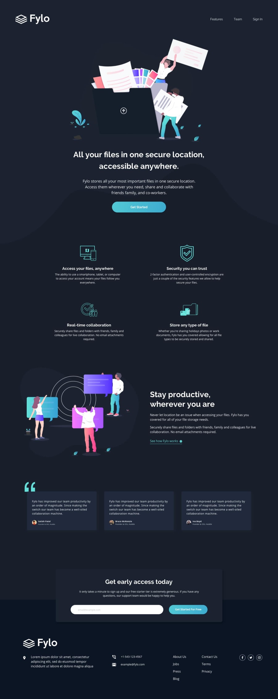
Mobile first approach using CSS Grid and Flexbox
Design comparison
Solution retrospective
This is my first Frontend Mentor challenge and I'm proud of what I've achieved. I'm open to any criticism or feedback on how I could've made it better.
I would especially like to know what is the best approach for making the svg change color with the hover state in the anchor button. I had to embed the svg code in the html instead of using the svg as an image so that I could manipulate the fill.
Also I would like to know if there is a better way to format the wave to be more similar to the design size. I struggled a bit with the height.
Thanks guys :)
Community feedback
- @DylanGangatPosted over 3 years ago
Thanks man really appreciate your feedback. I will make the neceesary changes.
1 - @ApplePieGiraffePosted over 3 years ago
Hi there, Dylan Gangat! 👋
Congratulations on completing your first Frontend Mentor challenge! 🎉 Good work on this one! 👍 Your solution looks pretty good and responds well! 🙌
I'd like to suggest,
- Adding a
max-widthto the header of the page in the desktop layout to prevent it from becoming too wide on extra-large screens. - Perhaps disabling the built-in browser validation of the email input so that the browser's message doesn't cover up the message provided by your custom form validation. 😉
As for the SVGs—I just do the same thing and simply add them directly to my HTML when I want to manipulate them by changing their fill color and stuff. 😄
Keep coding (and happy coding, too)! 😁
1 - Adding a
Please log in to post a comment
Log in with GitHubJoin our Discord community
Join thousands of Frontend Mentor community members taking the challenges, sharing resources, helping each other, and chatting about all things front-end!
Join our Discord
