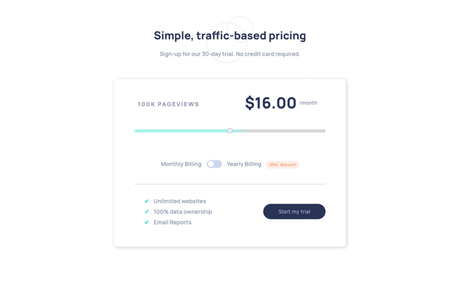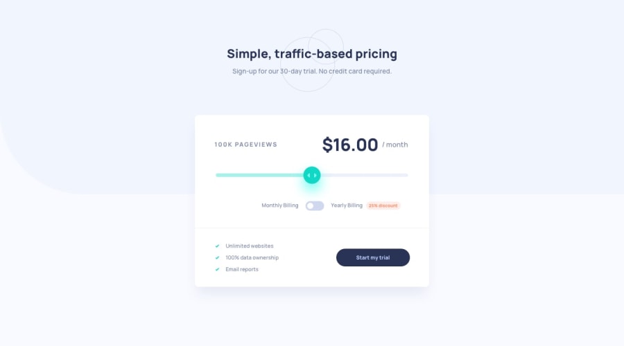
Mobile First Approach (Responsive dimensions (rems,%)) + FLEXBOX
Design comparison
Solution retrospective
It was great implementing this design. The only problem I faced is with the background color in the top-section of the body. It was overlapping on my slider-container. I tried z-index with relative positioning but didn't worked out. If anyone can help it would be very nice.
Community feedback
- @alexiscenriquezPosted over 3 years ago
Hi Paras, in addition to what Shivam said, you should change from mobile view at around 700/800px. Also, when switching from monthly to yearly, change "/month" to "/year"
Marked as helpful1 - @shivjoshi1996Posted over 3 years ago
Hey Paras,
Great job on this. I regards to the background color, I believe there is an image that you should use for it rather than setting a color. It's in the image folder "bg-pattern.svg". If you add that to the body using
background-image, setbackground-repeat: no-repeatand set the size to100vw 50vh, I think that should work.I also noticed that when I clicked on the 25% off toggle it would increase the page views and cost per month x10. I think the correct prices should be listed in the README which you got when you downloaded the files, so if you want an extra challenge then take a look :)
Marked as helpful0
Please log in to post a comment
Log in with GitHubJoin our Discord community
Join thousands of Frontend Mentor community members taking the challenges, sharing resources, helping each other, and chatting about all things front-end!
Join our Discord
