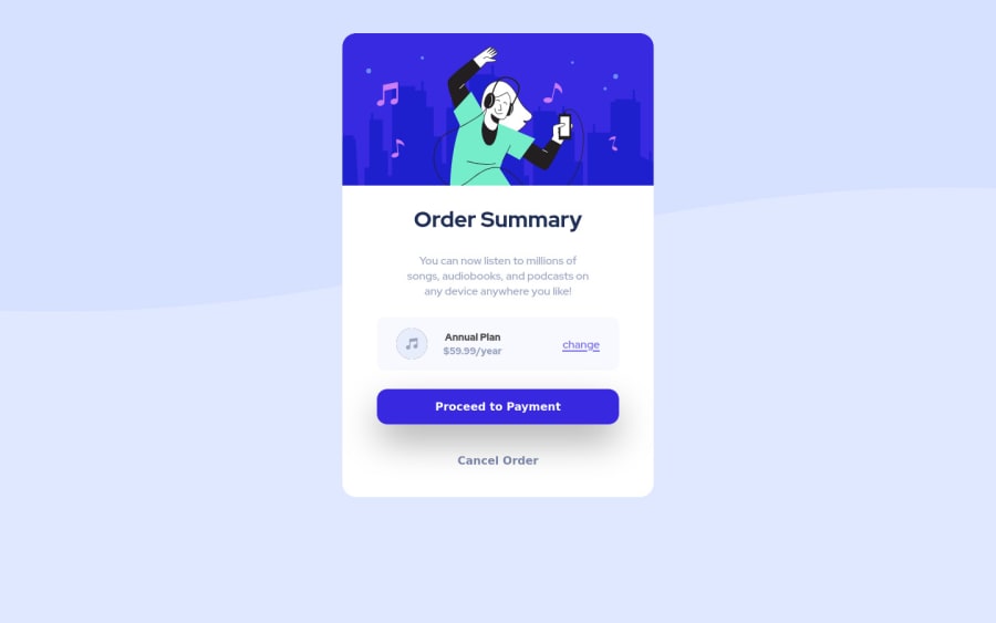
Design comparison
SolutionDesign
Community feedback
- @denieldenPosted almost 3 years ago
Hi Dogan, great job!
Try to remove all
marginfromimg andclass and use flexbox to the body for center the card. Read here -> flex guide Add this to body:display: flex; align-items: center; justify-content: center; flex-direction: column;Don't forget: IDs must be unique.
Hope this help and happy coding :)
Marked as helpful1@dsaglam94Posted almost 3 years ago@denielden hi there Deniel, thank you very much for your reply! You're right I still struggle when it comes to implementing flex box into my design. But I'll check and fix the parts you mentioned.
Wish you the best!
1
Please log in to post a comment
Log in with GitHubJoin our Discord community
Join thousands of Frontend Mentor community members taking the challenges, sharing resources, helping each other, and chatting about all things front-end!
Join our Discord
