Submitted about 3 years ago
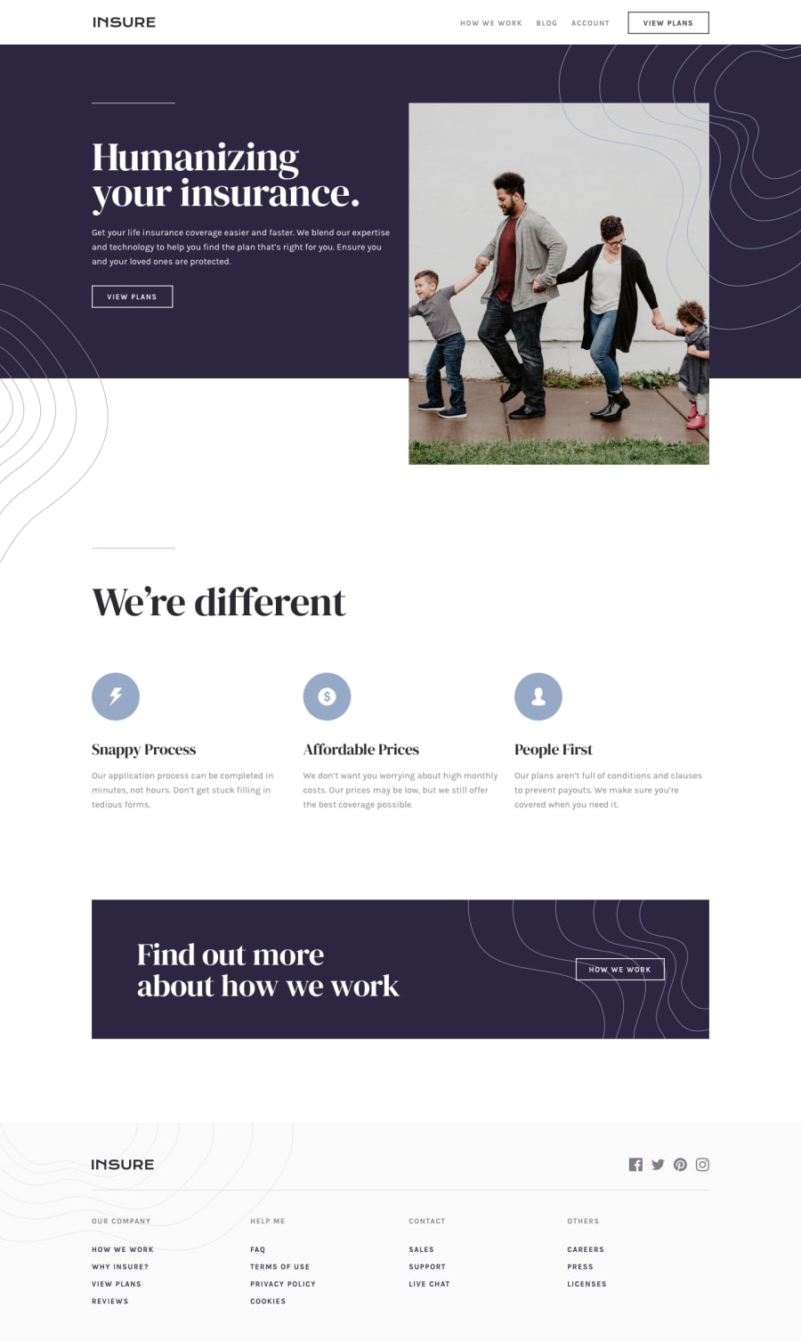
mobile first approach landing page using Grid and Flex layout
@erickamae-mateo
Design comparison
SolutionDesign
Solution retrospective
Any comments and suggestions are highly appreciated. Please view my Repository and look into my codes that needs improvement.
Community feedback
- @GabrielLaminasPosted about 3 years ago
Hello there. In the main content the button view plan is not click because a bg-pattern-intro-left-desktop is over it and the same problem is happening how we work button with bg-pattern-how-we-work-desktop over it. I think you must add z-index in these buttons and check them in diferents breakpoints.
Marked as helpful0@erickamae-mateoPosted about 3 years ago@GabrielLaminas hey! Thank you for your feedback. It’s really helpful. Yeah! I will do that. Thanks! 🙂
0
Please log in to post a comment
Log in with GitHubJoin our Discord community
Join thousands of Frontend Mentor community members taking the challenges, sharing resources, helping each other, and chatting about all things front-end!
Join our Discord
