
Mobile First approach HTML, CSS, JavaScript

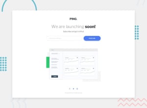
Design comparison

Solution retrospective
Hello 👋🏽,
I have just concluded yet another project, making it the last project for the Newbie challenge section for JavaScript. I did not find much of an issue on the one, to be honest, but as always, I would like to hear some suggestions from the community on how my code could be improved.
I got to learn about two HTML attributes to improve accessibility as well, and these are:
aria-invalidaria-errormessage
Thank you!!
Community feedback
- @0xabdulkhaliqPosted over 1 year ago
Hello there 👋. Congratulations on successfully completing the challenge! 🎉
- I have other recommendations regarding your code that I believe will be of great interest to you.
ANIMATION 🟡:
- Wow, the outcome of solution is amazing and the code is structured well also. But the part needs to be improved is to remove the animation of the illustration oscillation on devices where the users set their animations preferences to none
- The
prefers-reduced-motionmedia query in CSS allows you to target users who have expressed a preference for reduced motion on their devices or browsers.
- This is particularly useful for accommodating individuals with motion sensitivity or vestibular disorders. You can use this media query to adjust your CSS styles and provide a more comfortable experience for such users.
- Example:
/* Default styles */
.element {
/* your default styles here */
}

/* Reduced motion styles */
@media (prefers-reduced-motion: reduce) {
.element {
/* styles for reduced motion here */
}
}
- When a user's device or browser indicates a preference for reduced motion, the styles inside the
@media (prefers-reduced-motion: reduce)block will be applied, overriding the default styles. You can customize the styles within the media query to suit your specific requirements, such as reducing or removing animations, transitions, or any other motion-related effects.
- It's important to note that the
prefers-reduced-motionmedia query is supported in modern browsers, So we don't wanna worry to implement this method on our solution
.
I hope you find this helpful 😄 Above all, the solution you submitted is great !
Happy coding!
1@stephenikuomolaPosted over 1 year ago@0xAbdulKhalid
Thank you so much for your review of my code. I am happy you like my code structure, which I work on while I work on challenges.
I will study the
prefer-reduced-motionquery for the animation and implement it in my code, just as you have described. From your explanation, including it makes much sense as it makes it more accessible to users who interact with heavily animated websites.0@0xabdulkhaliqPosted over 1 year ago@TraversetheDOM Glad you found it helpful ! 🤠
0

Please log in to post a comment
Log in with GitHub
Join our Discord community
Join thousands of Frontend Mentor community members taking the challenges, sharing resources, helping each other, and chatting about all things front-end!
Join our Discord