Submitted over 3 years ago
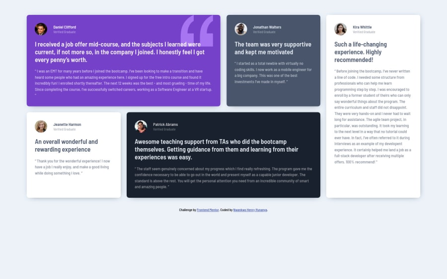
Mobile first approach grid of testimonials using CSS custom properties
@momeniHIN
Design comparison
SolutionDesign
Solution retrospective
Please I need clarification on something.
Is there a need to consider a third screen size between the mobile and desktop screen size provided? That is maybe considering a bigger screen size than 375px but smaller than 1440px.
Anyother correction or advice will be much appreciated.
Community feedback
- @palgrammingPosted over 3 years ago
you need to adjust your media queries. Your overall design looks really good but your media query break points are not giving it the results intended across all screen widths. Set the browser wider than 1440 and watch what happens
0@momeniHINPosted over 3 years ago@palgramming thanks for that, I will look into that.
0
Please log in to post a comment
Log in with GitHubJoin our Discord community
Join thousands of Frontend Mentor community members taking the challenges, sharing resources, helping each other, and chatting about all things front-end!
Join our Discord
