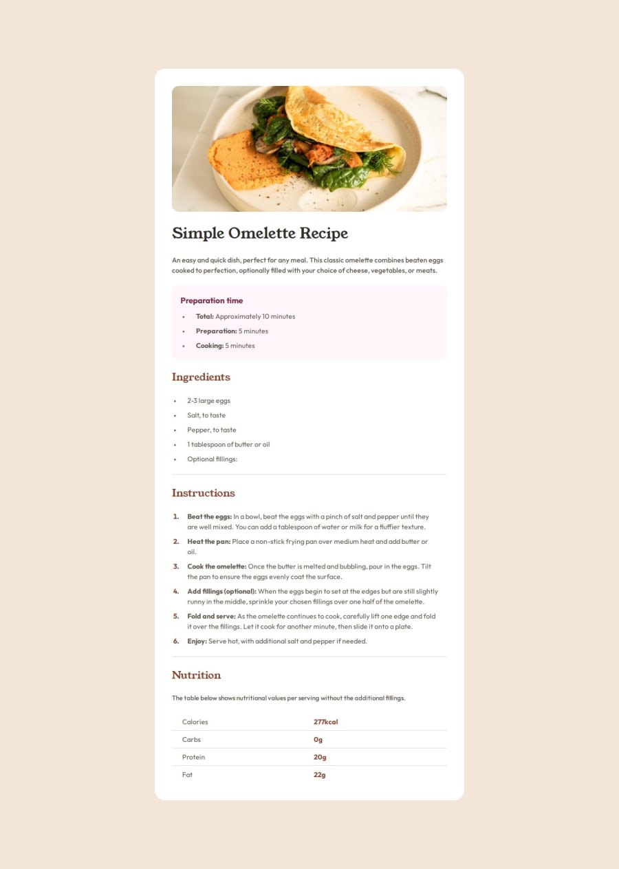
Design comparison
Solution retrospective
Better structure
- With the next project I will try to identify all similarities and differences between the elements and try to style them in a single rule, where possible. It could reduce the amount of editing of css file in a long way. After I've made my last commit, I've deleted another 25-30 unused lines of code.
There was different challenges I've encountered and all of them was funny to overcome. For example:
-
Creating borders for the table without setting its
border-collapseset tocollapseproperty. It does not work then. -
When I used
line-indenton thelist-itemtext within this item is getting moved to the given direction, however the next line of the text starts a bit left from the first line. I've tried several properties, but the only way I've achieved desired results was settingpadding-left: 1remon element. Jap, so easy. -
On the desktop and mobile version the image is looks differently. Mobile uses the full width of the page, where desktop version encloses it within a parent element and applies
border-radiuson it and so on. Solution I've used here is two different images withdisplayproperties set tohiddenwhen needs one, and revealing it when it needs.
Overall it was very interesting challenge to overcome
What specific areas of your project would you like help with?Always excited about writing semantic HTML and CSS classes naming conventions. I will welcome any feedback regarding these.
Please log in to post a comment
Log in with GitHubCommunity feedback
No feedback yet. Be the first to give feedback on Begli Amanov's solution.
Join our Discord community
Join thousands of Frontend Mentor community members taking the challenges, sharing resources, helping each other, and chatting about all things front-end!
Join our Discord
