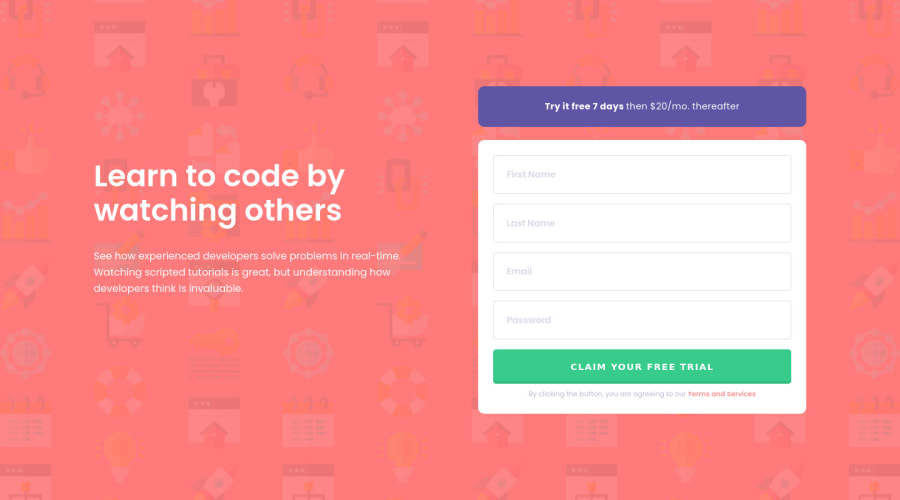
Mobile first approach and flex but without JavaScript
Design comparison
Solution retrospective
I had this one lying around for a few weeks, but I'd noticed I was struggling to understand flexbox. I got into learning and tweaking and trying and eventually created this. I'm clueless about the JavaScript and how to properly implement this. I'll continue looking, but I was just too ecstatic having finally finished the css (apart from a hover/focus-effect on the button). To be continued :)
Community feedback
- @grace-snowPosted about 4 years ago
Nice job! Particularly good use of min- values which a lot of people forget.
I think you should consider
- changing the hover/focus state on the button - changing shape like that is a bit too drastic
- adding a little padding between your flex children on larger screens (like padding-right on
.introductionor padding-left on.triggeruser) just to make sure the writing never touches your form on mid-sized screens.
Overall, great work though, well done!
1@katrien-sPosted about 4 years agoThanks for the feedback, highly appreciated. I was a bit clueless with the button, but I thought it over & adjusted it. Also added the padding.
1@grace-snowPosted about 4 years ago@graficdoctor Nice one!
I would suggest you still add a more obvious focus state to your button - the default for focusable elements is an outline, but there's lots of alternatives if you look around at other examples (see below).
Changing text color alone is generally considered inaccessible because of it's subtlety and because of colorblindness.
(I navigate by keyboard almost exclusively, that's why I notice this stuff, btw)
Alternative ways to demonstrate focus on a button:
- outline & outline-offset
- solid colored box-shadow
- position relative on the button and then a pseudo element that's a little wider and taller than 100% with a colored background (and z-index -1). The bonus with this approach is it gives you a focus outline that can match the border radius on the button - particularly good for pill-shaped buttons!
- changing border color (use a transparent border on un-focused button if it doesn't have a border already, to avoid layout shift)
- changing background color Or a combination of these!
Most of the same approaches can be used for inputs too, except they cannot have pseudo elements on the inputs themselves, they would have to be on a wrapper element.
Hope that's helpful. You're doing well with this.
0@katrien-sPosted about 4 years ago@grace-snow This is such useful information. I'm going to have a look and test various button-possibilities, this weekend, taking your remarks into consideration. Thank you.
1 - @ApplePieGiraffePosted about 4 years ago
Hey, nice work on this challenge, Katrien S! 👍
Your solution looks good and is responsive! 🙌
I suggest,
- Making the placeholder text for each of the input elements in the form a little lighter in color (as in the original design).
- Setting the
cursorproperty topointerfor the submit button. - For now, you can simply add the
requiredattribute to each of the input elements to have the browser do the form validation for you. It's quick and easy!
Keep coding (and happy coding, too)! 😁
0@katrien-sPosted about 4 years ago@ApplePieGiraffe Thanks for the feedback, highly appreciated. I adjusted as you suggested.
0 - @deanhopesPosted about 4 years ago
Well done mate keep it up.
0
Please log in to post a comment
Log in with GitHubJoin our Discord community
Join thousands of Frontend Mentor community members taking the challenges, sharing resources, helping each other, and chatting about all things front-end!
Join our Discord
