Design comparison
Solution retrospective
If u find mistakes,Help me to improve.
Community feedback
- @priyankaladPosted about 4 years ago
Hey,
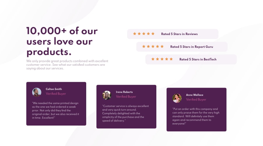
I have gone through your code, and it's pretty much cool except few alignments. I would recommend to implement this challenge using flexbox.
Also, I noticed that feedback card containers are currently left aligned in the mobile view. To make them middle aligned, you can add 'margin: 20px auto' to the class "cards-container".
Let me know if you need any further help
Happy Coding :)
2 - @pikapikamartPosted about 4 years ago
Just a suggestion. Instead of adding margins in the flex child, yeah child. You could have a
flex-basisorflexgiving a width, then just add agapproperty in the flex container so that the child doesn't scale via the margin used^1
Please log in to post a comment
Log in with GitHubJoin our Discord community
Join thousands of Frontend Mentor community members taking the challenges, sharing resources, helping each other, and chatting about all things front-end!
Join our Discord
