Mobile first and responsive Skilled E-learning Page (HTML & pure CSS)


Design comparison

Solution retrospective
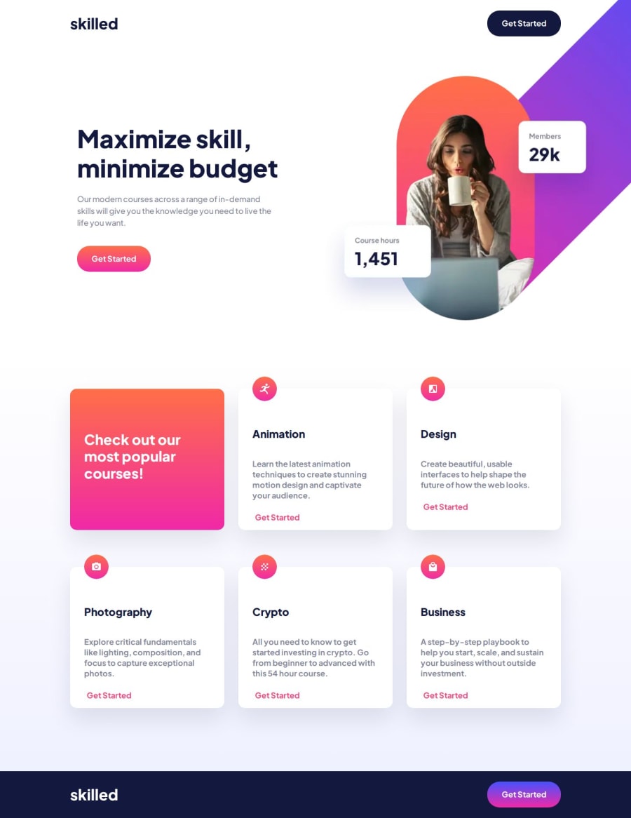
Another challenge met. I think I've done a pretty good job of managing the Hero section image according to devices, even if I'm still frustrated by the behavior of certain elements when the page is stretched from a mobile width to a tablet and then to a desktop. Should I create more generic classes instead of managing each component one by one? Would this speed up development?
What challenges did you encounter, and how did you overcome them?Positioning the image in the hero section according to device was particularly difficult, especially as it's a simple image, whereas the Figma model is made up of a multitude of shapes to recreate the image, which makes it difficult to take cues such as image size according to device and exact positioning. I don't think I've achieved pixel perfection. I created transparent rectangles on the Figma to take measurements 🤫🤫🤫
What specific areas of your project would you like help with?The management of Html elements Picture, Source, Img, etc... in order to have a dynamic management of images directly in Html. I don't know if I've done this section right, I'm open to criticism to improve.
Community feedback
Please log in to post a comment
Log in with GitHub
Join our Discord community
Join thousands of Frontend Mentor community members taking the challenges, sharing resources, helping each other, and chatting about all things front-end!
Join our Discord