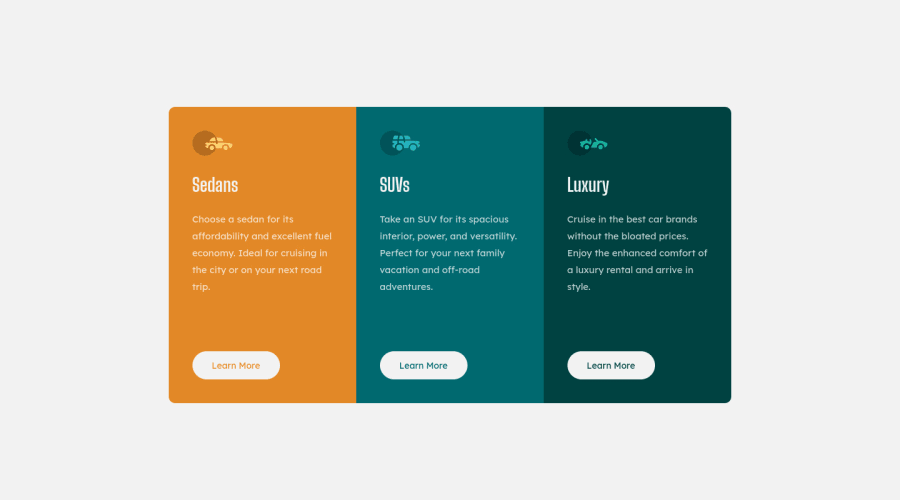
Design comparison
Solution retrospective
Feed back always welcome...
Community feedback
- @ArpadGBondorPosted almost 4 years ago
Thanks for reviewing my solution, I also checked yours. :)
Nice use of relative units, but I think the one place you should not use them, is setting up media queries. Relative units are great when we don't hardcode the font-size of the root element to a fix value, and we let the browser to change font sizes, but we shouldn't switch between mobile and desktop view just because the root font-size changed.
An other thing I noticed, there's an extra picture in the document showing that the button should change it's border+background color when you move the mouse over it. You can set it by adding a new css rule with ".cta:hover{}" selector. Use "cursor: pointer" to change the mouse here as well.
0 - @gustavodev1998Posted almost 4 years ago
You could use in your card title a CSS property named text-transform: uppercase so all the text is equal in the design just made this same challenge looks good bro :D
0@siriusdavePosted almost 4 years ago@gustavodev1998 yes the one bit of code I forgot to do ...
0
Please log in to post a comment
Log in with GitHubJoin our Discord community
Join thousands of Frontend Mentor community members taking the challenges, sharing resources, helping each other, and chatting about all things front-end!
Join our Discord
