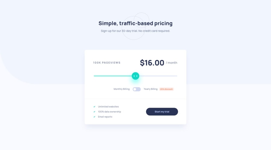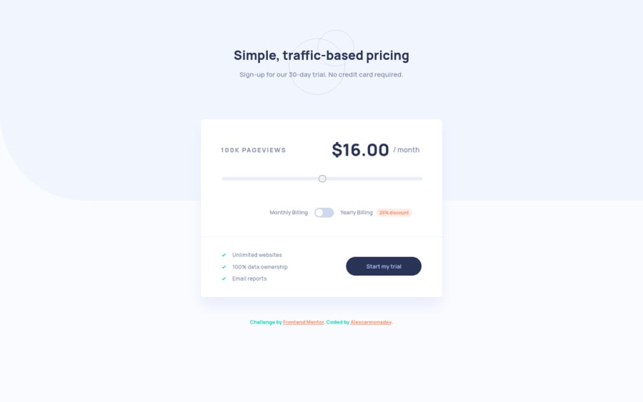
Design comparison
Solution retrospective
Do you think the code needs any changes? Please let me know so I can keep improving. And if you liked it, you know, give me a lot of love by pressing the like button.
Community feedback
- @AgataLiberskaPosted almost 3 years ago
Hi Alex, awesome work here! Two things I picked up: one is that the toggle and labels suddenly shift to the right at 767px, and the second is that because you set the input display to none, it is no longer accessible via keyboard. You can achieve the same effect without losing accessibility - if you google a combination of 'hiding elements accessibility', you'll get plenty of suggestions, I think CSS Tricks even has a nice example of it.
Once again, nice work here!
0@alexcarmonadevPosted almost 3 years ago@AgataLiberska Thank you so much for the report. I will keep it in mind for the next exercise 👍.
0
Please log in to post a comment
Log in with GitHubJoin our Discord community
Join thousands of Frontend Mentor community members taking the challenges, sharing resources, helping each other, and chatting about all things front-end!
Join our Discord