Submitted about 4 years ago
Mobile first 3-column-preview-card-component-main

@Will-1-Am

Design comparison
SolutionDesign

Solution retrospective
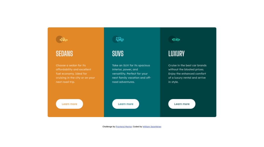
Your comments and critique will be greatly appreciated. Grid and flex-box are the main layout techniques used in this project.
Please log in to post a comment
Log in with GitHubCommunity feedback
- @brasspetals
Hi, William Spanfelner! 👋 Congrats on submitting another solution! 🎉
Here's a few suggestions to make it even better:
- A small design nitpick is that the background-color for the body as well as the buttons should be light gray rather than white.
- From 376px - 800px, the card overflows the screen as well as on smaller mobile screens (iPhone SE - 320px). To make your solution fully responsive and accomodate these sizes, you could lower the
min-widthof your cards div for small mobile screens, and adjust your media query for the medium/tablet widths. - Another common mistake (and something I've done myself 😅) is using
buttonelements for what are actually button-styled links. While they look like buttons, they don't have button functionality, so it's better practice to use anchor tags.
Hope these suggestions are helpful, and happy coding!
- @alexeykuz-sys
Well built, fully responsive page! Well done!
- @szcompany
Hello.
I really do like the way you did it. Congrats on finishing this project.


Join our Discord community
Join thousands of Frontend Mentor community members taking the challenges, sharing resources, helping each other, and chatting about all things front-end!
Join our Discord