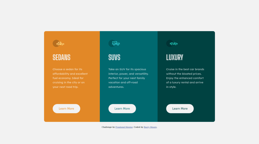


Design comparison

Solution retrospective
I began this challenge with the desire to use display: grid. However, after playing with it I found that using display: flex made the design just simpler to work out.
Do you think display: flex is the best option for layout with this simple design? What are the things you think through when deciding on using display: flex over display: grid?
Any other feedback is welcome!
Community feedback
- @pikapikamartPosted about 3 years ago
Hey, awesome work on this one. Layout in desktop looks great as well as the mobile layout, however, responsiveness could be improve because if you resize the screen in width, the layout start to get squeezed.
Fluffy Kas already said really great things about the layout, just going to add some as well:
- I don't suggest using
marginon thebodytag to give shape to the content, I would give explicitheightandwidthto the cards or make use ofgrid-template-columnsto give the properwidthto each of the cards if it is agridbut since it is aflexbox, I would usepaddingon thebodytag then useflex-basis: 100%for each card, this way, all 3 card will have the same dimension. - I wouldn't use
sectionfor each card, since those cards are just basically related right, all of them are card example, it would be better that thesectionis used by nesting all those 3 cards, because it is a "section of cards" - The
altfor each the car icons should bealt=""since those icons are just decoration. If an image is just decoration, usealt=""on them, but if theimgadds content, then use meaningfulaltvalue. Also, when usingaltavoid adding words that relates to "graphic" such as "vector, image, icon...", those are already images that is why you don't need to add them. - Avoid using multiple
h1on a webpage, use at least only 1h1per webpage, so change those intoh2. But every webpage needs to have 1h1, on this one, theh1would be a screen-reader only text. Have a look at Grace's solution, inspect the layout and see how she uses theh1element and see the css stylings applied on it as well. You will be using a lot like this in your career. learn morecould be better if it was a link, since it would be like a link to "learn more" about the car.
Other than those, great work, just the responsiveness, avoid making them to be squeezed. Still, great job :>
0 - I don't suggest using
- @FluffyKasPosted about 3 years ago
Hey, your solution looks good! When I started coding I was all about grid. Now I'm noticing how rarely I actually use it. I still love it, it's good for centering elements easily or when I have a more complex layout but for smaller projects and when I just need to align things, I go for flexbox. At the end of the day, it doesn't matter which one you choose as long as it works without any strange "hacks", so whatever suits you. :)
As to your solution, I'd add 2 things:
-
Your buttons use the browser's default font-family. You need to set them specifically or they do this.
-
If you wanted to keep your buttons from jumping around as the text changes, you could give them a
position: absoluteand have them fixed to the bottom :)
0 -


Please log in to post a comment
Log in with GitHub
Join our Discord community
Join thousands of Frontend Mentor community members taking the challenges, sharing resources, helping each other, and chatting about all things front-end!
Join our Discord