Submitted 4 months ago
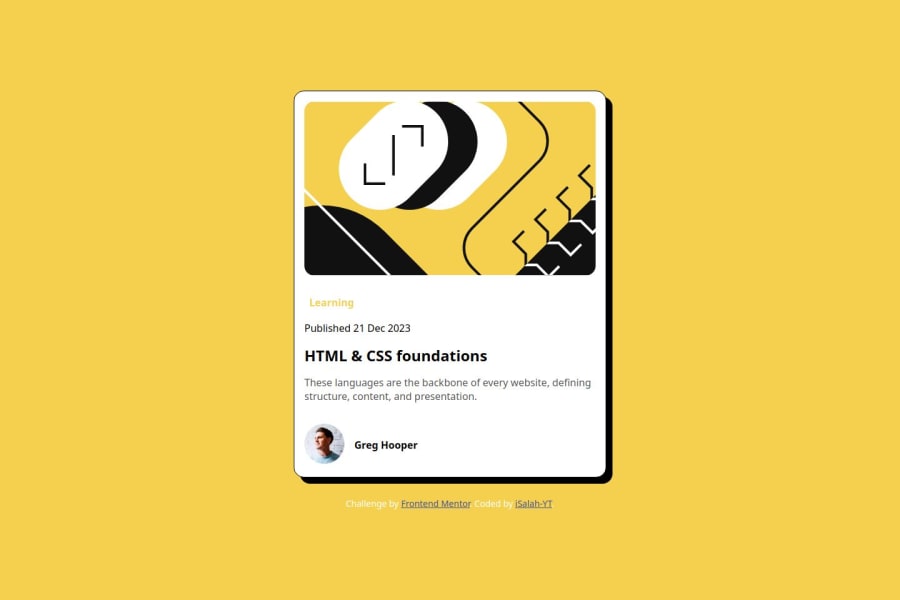
Mobile First - Blog Preview Component in Vanilla HTML and CSS
@iSalah-YT
Design comparison
SolutionDesign
Community feedback
- @ToumariPosted 4 months ago
Hello!
Firstly great effort on your card it looks great!
Just a couple of pointers for you to help you on your way:
-
The styling of a few elements differs from the original design, things like the size of the avatar and the learning subheading
-
You're using pixel values for some of your padding & margin, I'd recommend getting comfortable with rem / em and the various other units of size. These help with accessibility & with scalability when it comes to responsiveness!
0 -
Please log in to post a comment
Log in with GitHubJoin our Discord community
Join thousands of Frontend Mentor community members taking the challenges, sharing resources, helping each other, and chatting about all things front-end!
Join our Discord
