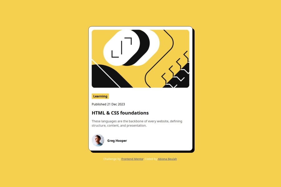
Mobile design-Blog Preview Card using Html and CSS as primary Stack
Design comparison
Solution retrospective
What I might be proud of:
- Clean and modular code: Writing HTML and CSS in a structured and organized manner can be something to be proud of. This includes using proper indentation, comments, and following best practices.
- Responsive design: Creating a blog preview card that looks good and functions well on various devices and screen sizes can be an achievement. This demonstrates a good understanding of responsive design principles.
- Accessibility: Ensuring that your blog preview card is accessible to all users, including those with disabilities, by following accessibility standards and best practices can be a point of pride.
- Visual design: If you've created an aesthetically pleasing and visually appealing blog preview card, you might be proud of your design skills.
What I might do differently next time:
- Code optimization: You might find ways to optimize your HTML and CSS code to improve performance and load times. This could involve reducing redundancy, optimizing images, or using CSS preprocessors like Sass to write more efficient stylesheets.
- Browser compatibility: Ensuring cross-browser compatibility is important. You might test your blog preview card in different browsers and make adjustments as needed to ensure consistent display and functionality.
- User feedback: Incorporating feedback from users or peers can help you identify areas for improvement. You might gather feedback on usability, design, or functionality and use it to refine your blog preview card in future iterations.
- Learning and growth: Reflecting on your coding process and identifying areas where you can learn and grow can be valuable. This might involve learning new techniques, exploring advanced CSS features, or delving deeper into responsive design principles.
Overall, continuous improvement is key in web development, and there's always something new to learn and explore in HTML and CSS.
What challenges did you encounter, and how did you overcome them?Overall, overcoming these challenges requires a combination of technical skills, attention to detail, and a willingness to iterate and refine the code based on testing and feedback.
What specific areas of your project would you like help with?styling
Community feedback
- @grace-snowPosted 7 months ago
Hi, i noticed some things that need changing in this code. Hopefully this helps with your learning process. In particular pay attention to HTML at this stage. It's the foundation of everything else and the most important thing when it comes to web accessibility.
- every page needs a main. All content should be contained within landmarks. This needs a main to wrap the component and a footer for the attribution.
- img elements must have an alt attribute. That is essential. There's a great post in the resources channel on discord about how and when to write alt descriptions on images.
- learning is a paragraph not a heading. It's just a topic tag for the blog.
- think about the context of where components like this would be used in a real site. This kind of card would never be used as the page title, therefore it can't have a h1. Use a h2 for the card heading.
- this is a signposting component, a card that links to a blog. But how would anyone access that blog when you've not included a link? It needs an anchor inside the heading (wrapping the title of the blog). Note: I recommend you always test solutions with keyboard if they are meant to be interactive to check it works for all users not just mouse users.
- lists must only be used for list content. There is no list in this design. It's really important not to mis-use lists as they are meaningful elements.
- remember to update the link in the attribution to your page. It can go to your frontend mentor profile page or to your github page.
- get into the habit of including a full modern css reset at the start of the styles in every project. Andy Bell or Josh Comeau both have good ones you can look up and use.
- this challenge must not have a media query. It doesn't need one and even if it did it would need to be defined in rem or em.
- the body should have a little padding and styles to center the component even on mobile screens.
- never limit the height of elements that contain text, including the body. Instead of height 100vh use min-height so that the body can extend beyond the height of the viewport when necessary.
- the max width on the component needs to be in rem not px so that it can scale correctly for all users, including those with a different text size.
- try to avoid using complex css selectors like nth child unless you really need to. Instead place classes directly on what you want to style. It's much more maintainable, easier to read and avoids specificity wars in css. If you return to this css after a break you'll have no idea what all those styles are doing without combing through the html and switching between css and html to match up the selectors. That's a painful way to work.
- don't add cursor pointer to non-interactive elements. As I raised above, this component needs a link in the heading. To make the whole card clickable, you then need to add position relative to the card ; and a pseudo element on the link that's absolutely positioned and sized to fill the card. That will make the link extend out over the component so it is all clickable.
- it looks like you've not included the font(s) correctly. Did you mean to add local ones to the repo or link to fonts hosted on Google fonts? I can't recommend what to fix as I'm not sure on what your intended approach was.
Marked as helpful0@Beulah-TomiPosted 7 months agoThank you so much, this was really helpful I'll take note of this. @grace-snow
0
Please log in to post a comment
Log in with GitHubJoin our Discord community
Join thousands of Frontend Mentor community members taking the challenges, sharing resources, helping each other, and chatting about all things front-end!
Join our Discord