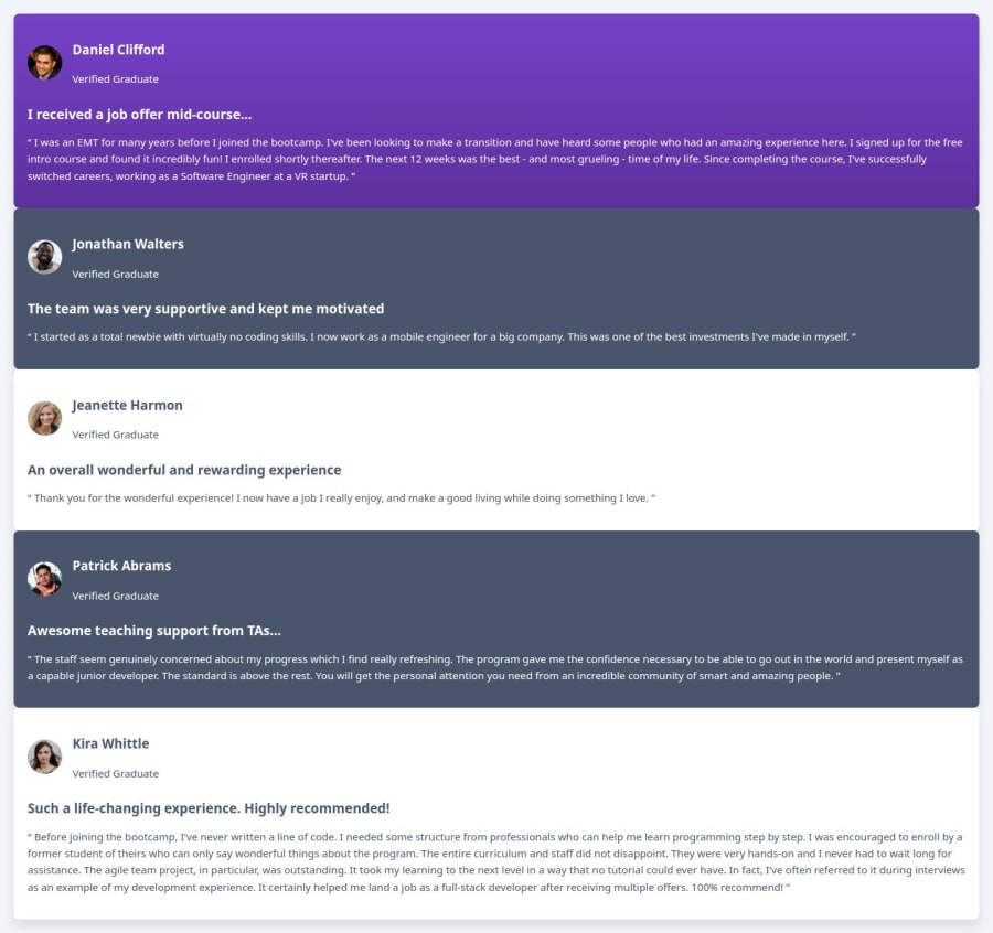
Design comparison
SolutionDesign
Community feedback
- @kassahunAmdiePosted about 2 months ago
Hello @Manshiporiya, You have your code down for the mobile version. I suggest two additional changes though.
- Under your testimonial-container add another div element with a class of your liking to wrap all the cards and apply the flex to it. Your gap should also be applied here. That will fix the gap. I see it applied in your CSS file on the testimonial-container, but not showing on the layout.
- For the quotation mark on the purple card, try to apply the SVG file as a background and with no-repeating. As for position use top right and 15% for mobile and about 20% on desktop. This brings me to your desktop layout. After you choose your break point, which looks like you chose 768px, you will have to change your layout to "display grid". Also in your media query instead of max-width, use min-width. Min-width will make it change to grid display once you hit your break point. This website "https://css-tricks.com/almanac/ " and the MDN web page are my go to resources. I am sure you will get lots of ideas on grid and how to position them so that you can match the design layout. Good job giving this challenge a shot.
0
Please log in to post a comment
Log in with GitHubJoin our Discord community
Join thousands of Frontend Mentor community members taking the challenges, sharing resources, helping each other, and chatting about all things front-end!
Join our Discord
