Mobile & Desktop first solution using CSS Grid and HTML


Design comparison

Solution retrospective
I find a little difficult at making responsive of mobile page. I am not sure about CSS at style file at image. I want to sent to me the best solution of this challenge and my mistakes to upgrade myself.
Community feedback
- @d-donnePosted over 1 year ago
Hi there, Shimaa, good job so far. I've looked at your code, and I have some notes that could be of help to you. These are more of opininons based on what I know so far that I think will help.
NOTES
I've noticed you've used a lot of divs in your HTML. Since the div element has no semantic value, there's no need to use it unless you need to group certain elements together to help in styling or any other purpose.
img - you have specified the dimensions of your image a bit too big looking at the design.
HTML
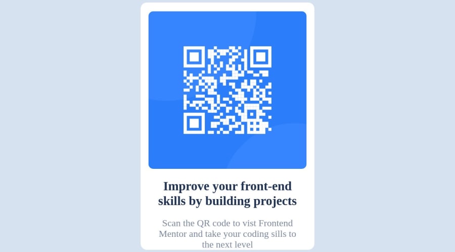
<main class="container">
    <div class="container-image">
        <img src="image-qr-code.png">
    </div>
    <div class="container-body">
        <h1>Improve your front-end skills by building projects</h1>
        <p>
            Scan the QR code to vist Frontend Mentor and take your coding sills to the next level
        </p>
    </div>
</main>
For accessibility reasons, you could change your container div to main.
The container then can have two divs nested in it, one with a class of container-image for QR code image, and the other with class of container-body for the heading and text. This will help if you want to you use flexbox or grid, and the naming will also help easily identify them.
After setting the width of the container, you don't necessary need to give the image a seperate width. and the texts will also follow to suite the width. You can then add some padding for the internal spacing. I usually like to do `box-sizing: border-box', so my padding and margin don't increase the containers size. like so before any other styling:
CSS
* {
  box-sizing: border-box;

body {
     width: 100vw;
     height: 100vh;

    /* center the container */
     display: flex;
     align-items: center;
     justify-content: center;
}

.container {
    display: flex;
    width: 50vw; /* edit to suit design */
    padding: 15px; /* edit to suit design */

h1 {
   font-weight: 700;
}
To make it easier to follow, your CSS selects should be in the order they appear in the HTML or page, and grouped according to sections in the CSS file.
Also, the font-weight CSS proper does not take any units.
I hope this helps, @shimaaosama. Please ask more questions, if needed.
You can look at my solution here
0

Please log in to post a comment
Log in with GitHub
Join our Discord community
Join thousands of Frontend Mentor community members taking the challenges, sharing resources, helping each other, and chatting about all things front-end!
Join our Discord