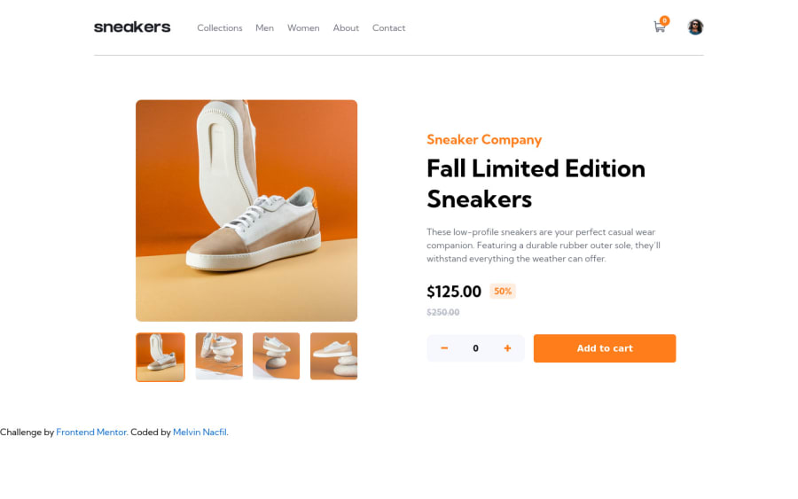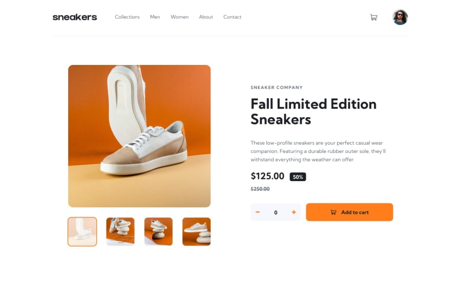
Mobile and Desktop Ecommerce build using pure HTML, CSS and Vanilla JS
Design comparison
Community feedback
- @sulemaan7070Posted over 1 year ago
hey 😄Melvin Nacfil, congratulations on completing the challenge... here are a few tips to make your site better.
1.The p element named as .amount should have specific width so that it won't affect the whole page when clicking on + or** -**...
2.I think you forgot to add the
cart-svgto theadd to cartbutton. and it would look great if you add box-shadow to that button. just like the design.3.Add the functionality🪛 of
closing the mobile menu when user clicks on the overlaysince most users click on an overlay to close the mobile menu...4.center the attribution that would look good.
hope that helps, happy coding💯🔥👍🏻
Marked as helpful0@mnacfilPosted over 1 year ago@sulemaan7070 Thanks for taking your time to give feedback on my work. Will do it
Cheers
1
Please log in to post a comment
Log in with GitHubJoin our Discord community
Join thousands of Frontend Mentor community members taking the challenges, sharing resources, helping each other, and chatting about all things front-end!
Join our Discord
