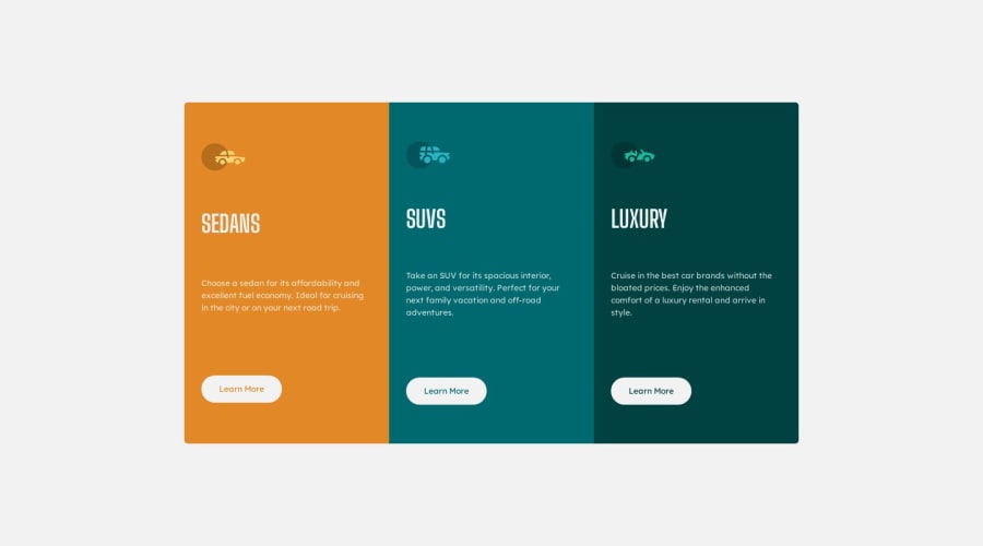
Not Found
Not Found
Not Found
Not Found
Not Found
Not Found
Not Found
Not Found
Not Found
Not Found
Not Found
Not Found
Not Found
Not Found
Not Found
Not Found
Not Found
Not Found
Not Found
Not Found

Submitted

Mobile & Desktop 3-Column Card / Flexbox

Kirsten βœ¨β€’ 460

@ofthewildfire

Desktop design screenshot for the 3-column preview card component coding challenge

This is a solution for...

  • HTML
  • CSS
1newbie
View challenge

Design comparison


SolutionDesign

Solution retrospective


I would appreciate any advice & tips you may have, I dont currently have any questions about this challenge and I did not find it "difficult" -- I did muck up, but Google searches solved those in under 5-min each. So, please, if you have any feedback/advice, gladly appreciate.

I would also like tips on better usage on CSS.

PS: Still learning Responsive web design.

Community feedback

Nick Xitcoβ€’ 30

@NickXitco

Posted

Great job!

Overall some great positives:

  • The design is functional, responsive, and looks great!
  • Good use of custom properties for colors, even for simple stuff like this getting in that habit will be super helpful :)
  • The media query is functional and works brilliantly!

Some Nitpicks:

  • Try adding a lot more text to one of the vehicle descriptions, say, doubling the length of text. See how that affects the layout? Even in its current state, the text doesn't quite line up right. Ideally, all the vehicle titles would be on the same line, and the tops of all the descriptions would be on the same line. You may want to consider defining your spacing explicitly, rather than relying on the content + space-evenly to do the spacing for you.
  • Adding an h1 to the page shouldn't be a box you simply check. It's there to help screen readers, so putting an empty h1 tag is almost more harmful than it is helpful. You can invent some text to put there which describes the page and then visually hide it (not with display: none; or visibility: hidden, you may want to look into a visually-hidden utility class, they're fairly interesting and very useful)
  • I would revisit your semantic html for this section. The main issue is that this page doesn't really have 3 "sections". It's one section, with 3 related items. I would recommend either a <section> with 3 <article>s inside, or perhaps a <ul>. You want to give some representation that these 3 items are related, and the current html doesn't do that.
  • Because of the above point, you've made your life a bit harder with the border radius. You may benefit in the future from sketching out where your containers are on the page. In my mind, this isn't 3 separate containers, with the outer two having their outside corners rounded, it's 1 container with all four corners rounded. It'd make your classes much simpler too, that way you're just using the class for the color.
  • As it stands, this design is responsive, but typically, adding fixed widths/heights to things is bad, especially in pixels, as it restricts both you and your users if you have to change the section in the future or if your users change their text sizes. In the future, fill in the blanks between the two breakpoints and see as a designer what you'd want the section to look like!

Marked as helpful

0

Kirsten βœ¨β€’ 460

@ofthewildfire

Posted

@NickXitco Thank you so much for all this detail. I will read it all again and implement all these changes, thank you so freaking much <333

1

Please log in to post a comment

Log in with GitHub
Discord logo

Join our Discord community

Join thousands of Frontend Mentor community members taking the challenges, sharing resources, helping each other, and chatting about all things front-end!

Join our Discord