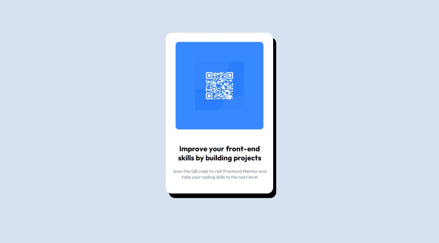


Design comparison
SolutionDesign

Solution retrospective
What are you most proud of, and what would you do differently next time?
I added box-shadow on it
What challenges did you encounter, and how did you overcome them?centering a div, I finished it with all the existing center elements and used the top elements
What specific areas of your project would you like help with?improving my code and clean code to be better and remove unuseful code
Community feedback
Please log in to post a comment
Log in with GitHub
Join our Discord community
Join thousands of Frontend Mentor community members taking the challenges, sharing resources, helping each other, and chatting about all things front-end!
Join our Discord