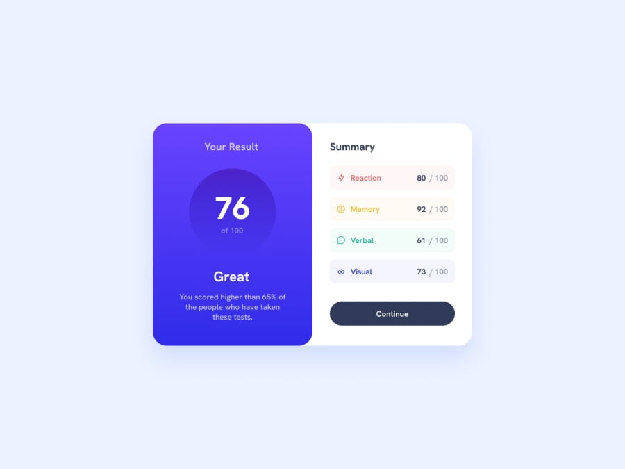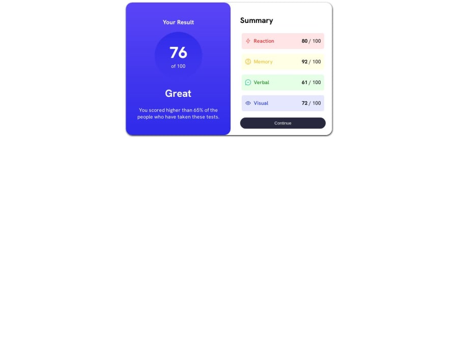
Design comparison
SolutionDesign
Solution retrospective
I ran into a few difficulties I could use assistance with. Without the figma files, I was unable to figure out the exact gradient for the circle. I also don't have a lot of experience in converting to mobile from a web dev standpoint, and I would be curious to see other solutions on how to make mine more mobile-friendly.
Community feedback
- @pkindalovPosted 12 months ago
Hi Alex,
First of all good job. Well done. It looks very nice.
I hope you can take some little pieces of advice in my opinion of course:
- I don't know which editor or IDE you use, but if you use Visual Studio Code, I recommend you try the Prettier plugin to format better your code. Just for better readability.
- In my opinion you can replace this
<div class="main">
which just<main></main>
. This way you will write more semantic html. No need to replace<main>
with a<div>
. - I see from your code that you often put
<section>
elements inside a div. But in my opinion, it must be reversed. I mean firstly<section>
and inside<div>
. Again to be more semantic. - About the gradient, I think that the idea is mainly to play with gradients and different options that they suggest.
- About responsiveness would it be more easy if you start using grid or flexbox from the start? I mean, for example, creating a container that puts elements horizontally with Flexbox for example. In that way when you are on mobile media query you can just change flex-direction from row to column.
- Also for responsiveness, I recommend you to use more rem instead of px.
I hope these notes to help you. I apologize if I wrote something wrong.
Best regards
0
Please log in to post a comment
Log in with GitHubJoin our Discord community
Join thousands of Frontend Mentor community members taking the challenges, sharing resources, helping each other, and chatting about all things front-end!
Join our Discord