
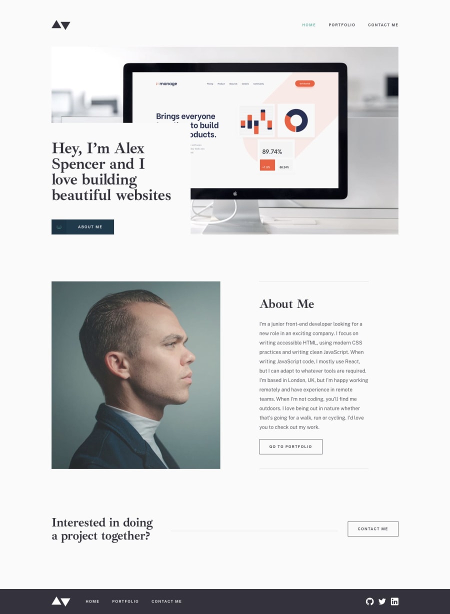
Portfolio: The Minimalist's Paradise


Design comparison
Solution retrospective
Libraries are the shoulders of giants, stand on them
The more I learn, the more I realize how little I know. While it is important to build a strong foundation in the basics and develop a keen understanding of how certain mechanisms work, I do not think there is utility in creating everything from scratch. There are libraries that have been created by other pioneers forging courageous paths so that we can run where they trudged; all we need do is receive the gift they have bestowed and credit their efforts. In my project I use Bulma to create styled and ready to deploy elements which can allow my focus to be placed elsewhere. Additionaly, in this project I utylize an amazing css only svg animation called flippin' burgers by Mikael Ainalem for the nav burger menu. These tools save time and for them I am grateful.
What challenges did you encounter, and how did you overcome them?Allow the browser to do the work
I started this project with a pixel-perfect mindset. The solution was going to match every inch of the designer's vision which mean that every height, width, margin and font-size was going to be coded. I understood some vague concept of responsiveness, but failed to realize my mindset was antithetical to its very spirit. Once the desktop and tablet designs were complete, I realized with my work on the mobile layout that I had made some drastic mistakes. At this point I learned one of my most valuable lessons from front end legend, Kevin Powell: when first created, all websites are responsive; if at some point they lose this capability it is always because of code you wrote. Needless to say, I went back through my stylesheet and culled every mention of a specific height and width and utilyzed min and max values instead.
What specific areas of your project would you like help with?Continued development
Working on this project allowed me to use grid for the first time. After learning enough to attempt a semi-competent application in a responsive layout I can agree that more experience with grid can allow the development of interesting product cards. Additionaly, I used absolute positioning for the first time. This tool can allow for unorthodox placement of elements in the DOM and I will be using it in the future.
Community feedback
Please log in to post a comment
Log in with GitHub
Join our Discord community
Join thousands of Frontend Mentor community members taking the challenges, sharing resources, helping each other, and chatting about all things front-end!
Join our Discord