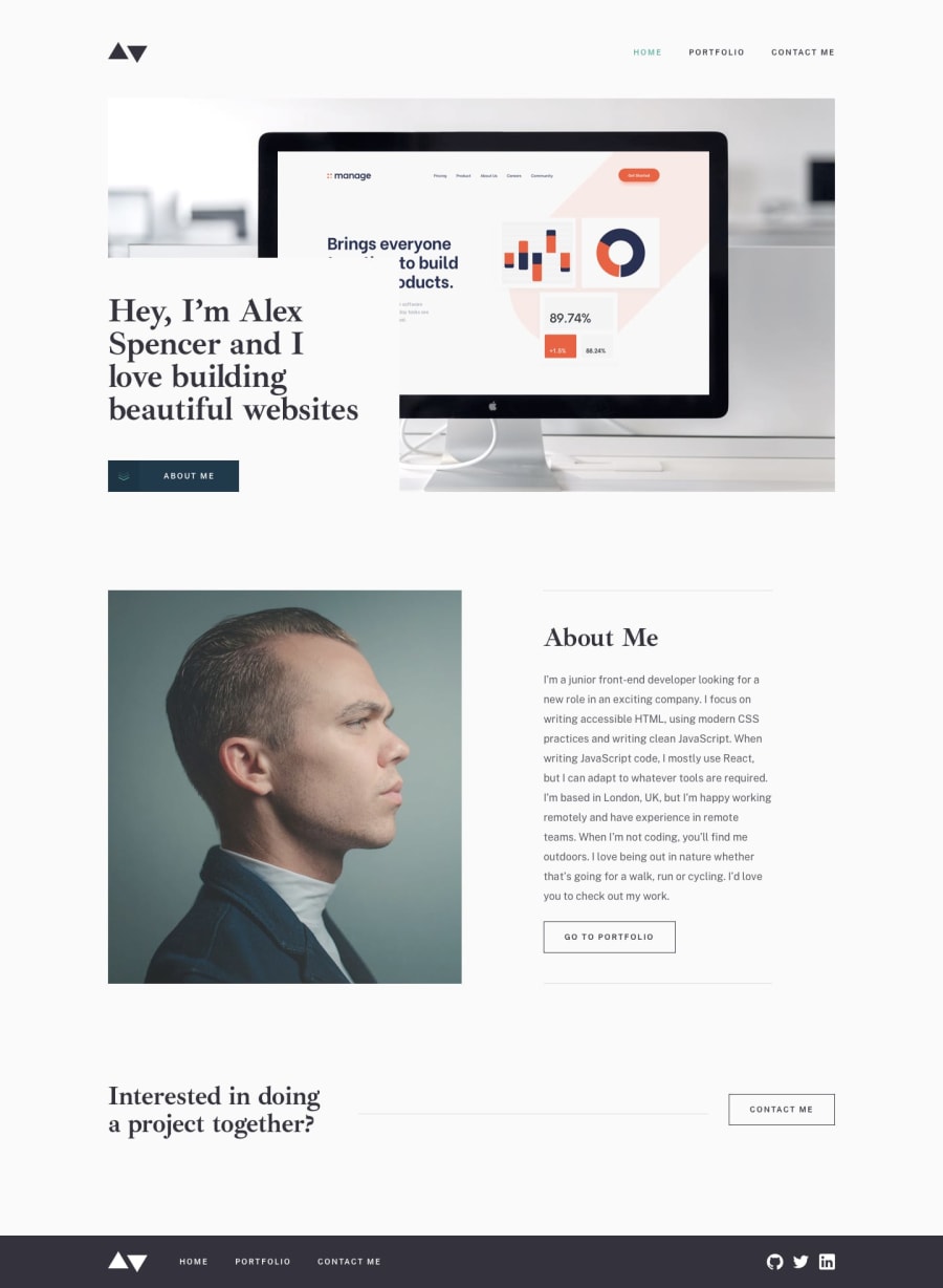
Responive Simple Layout with NextJS, Typescript and CSS Modules
Design comparison
Solution retrospective
I had a lot of fun with this challenge, this was the first time I used NextJS, Typescript and CSS modules which took a little to get used to but loved learning and trying it out.
I definitely like CSS modules but I did miss the ease and customizability of SCSS, honestly I think I would've been done quicker if I did. There was difficulty in trying to get the form to render invalid states only when a user clicks on them but found a great article on how to do it which I linked on Github. Accessibility is something I also struggled with for navigation and look to up my game on in the next project.
I know there are a lot of things I could improve on this project and probably will come back in time but for now, it's done and good enough.
If there are any suggestions or Ideas on ways to improve on this especially Accessibility wise, please throw them my way! :D
Community feedback
- @catherineisonlinePosted almost 2 years ago
Looks nice 🙌🏻 Don't forget to add the lang attribute to the HTML tag and I would also add the transitions to the hover states. To avoid accessibility problems with the social media icons where you don't want to use text inside <a> tags, you can create a <span> tag inside the <a> tag with description text but visually hide it. Another option is also aria-hidden="true" but as I know it's also not advised.
Marked as helpful1@NicholasAnichPosted almost 2 years ago@catherineisonline Hey Catherine! Thanks a lot, I'll try it out! :D Your projects are awesome by the way!
0
Please log in to post a comment
Log in with GitHubJoin our Discord community
Join thousands of Frontend Mentor community members taking the challenges, sharing resources, helping each other, and chatting about all things front-end!
Join our Discord
