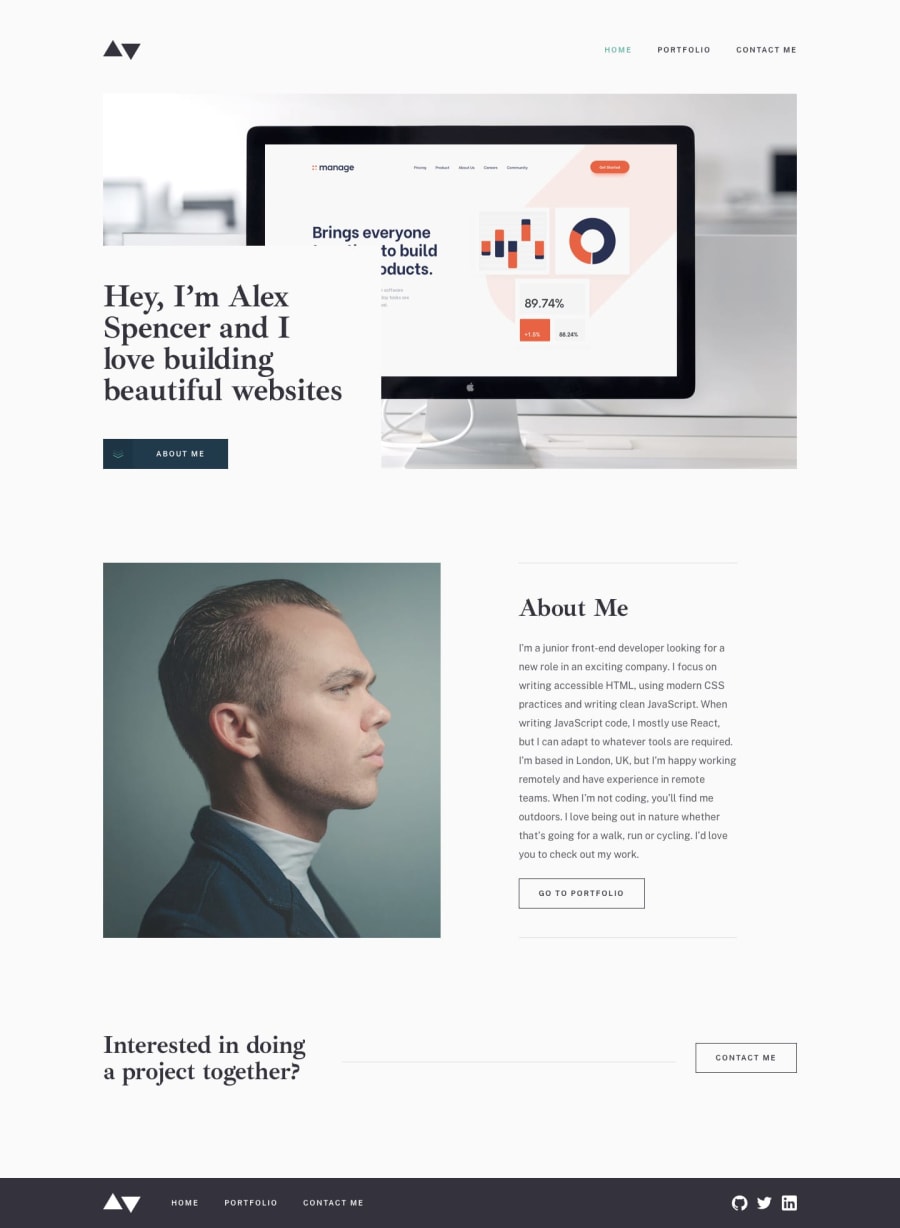
Design comparison
Solution retrospective
Feedback welcome. The only thing I haven't yet figured out is the best way to set the Portfolio entry as active when on a project detail page. I think I've met all of the other design requirements.
Community feedback
- @Amanpatil-DevPosted over 3 years ago
Hello Richard👋 So Awesome!! Its look cool on desktop nice job👍
-The issue that I found was when you go to screen width 767px to 753px The navbar gets Un-Styled
-The hamburger for mobile nav-bar get Displayed at width 752px No Problem, But the placement of the navbar is little off when open navbar under screen-width 700px
That's All Happy Coding👍
Marked as helpful0@richardcyrusPosted over 3 years ago@Amanpatil-Dev Thanks for the feedback. I've fixed the menu.
1
Please log in to post a comment
Log in with GitHubJoin our Discord community
Join thousands of Frontend Mentor community members taking the challenges, sharing resources, helping each other, and chatting about all things front-end!
Join our Discord
