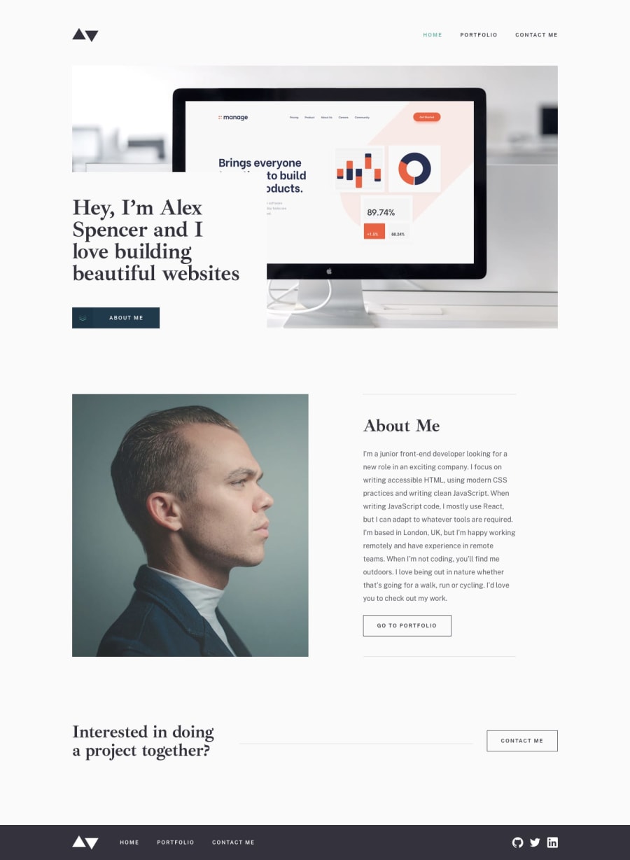
Minimalist Portfolio - 11ty, SCSS, progressive enhancement
Design comparison
Solution retrospective
UPDATE:
Fixed some issues that were bothering me on this one.
i) Fixed the textarea issue below - I had created in input with the type textarea - only took me a couple of hours to work that one out! 🤦♂️
ii) Fixed the project title not appearing in the title on each project page. Some hectic delving into 11tys pagination object was involved...
iii) Linked up all my other FEM projects so that each project actually links to a FEM project I did - just for fun... Only bookmark challenge remains outstanding.
Again, any feedback most welcome
Thanks
I learnt a lot about 11ty on this project. I used collections and pagination for the first time. It was difficult but I can see this being very useful. I think I could have hard coded this in about half the time, but making edits to this site is now a real breeze thanks to 11ty and nunjunks templating.
Using 11ty's pagination feature (and collections), adding projects from a markdown file updates the portfolio page and the pagination links and text automatically. I also inlined my CSS to improve performance. I split my CSS into 'critical', which appears on every page, and other page specific CSS is inlined on each page
I would very much welcome advice on the following issues:
Regarding 11ty, I spent a lot of time working out pagination. I thought that content that I put below the last --- in my .md files would appear in the template I referenced. This didn't happen. I suspect something to do with 11ty's data cascade, but I haven't understood what was happening yet.
One thing that has driven me crazy is styling the textarea on the form. I would like the text to wrap, at the moment it just carries on on one line, and I would like to user inputted text to start at the top (in the same location as the placeholder text). I moved the placeholder text, but cannot get the user text to start where I want it to.
Any other advice and suggestions would be gratefully received. Thanks!
Community feedback
- @MarlonPassos-gitPosted over 3 years ago
wow what a nice project, it would even give you to use this site as if it were your own portfolio, just changing the name and photo. I really liked it a lot, especially your git-hub, I found a lot of cool information about things I didn't even know about, this 11ty the piccalil site and other things.
I don't know much about these types of 11ty projects so it's hard for me to comment on something, but when I was testing the send form button, it would send even if I hadn't written anything in the message field. I don't know if it was intentional but it seems like a mistake.
Again, very good, this is the metality of projects that I like to see here in the community
Marked as helpful1P@dwhensonPosted over 3 years ago@MarlonPassos-git thanks I'll check into that. I it shouldn't submit a blank form... I've not really got into forms and submissions yet. Something I need to work on.
0@MarlonPassos-gitPosted over 3 years ago@dwhenson I found out, just put a "required" in textarea
Marked as helpful0 - @Kl3vaPosted over 3 years ago
Your menu appears to cause a horizontal scroll on mobile devices
1P@dwhensonPosted over 3 years ago@Kl3va thanks I think I need to add an overflow-x setting. I thought that I had but I might have forgotten it here - what device are you on? It seems fine on my old iphone.
1@Kl3vaPosted over 3 years ago@dwhenson I’m using the iphone8 to access it. It’s still visible due to the alignment of the navigation menu.
1P@dwhensonPosted over 3 years ago@Kl3va Thanks a lot I'll have a look into that.
Cheers Dave
1
Please log in to post a comment
Log in with GitHubJoin our Discord community
Join thousands of Frontend Mentor community members taking the challenges, sharing resources, helping each other, and chatting about all things front-end!
Join our Discord
