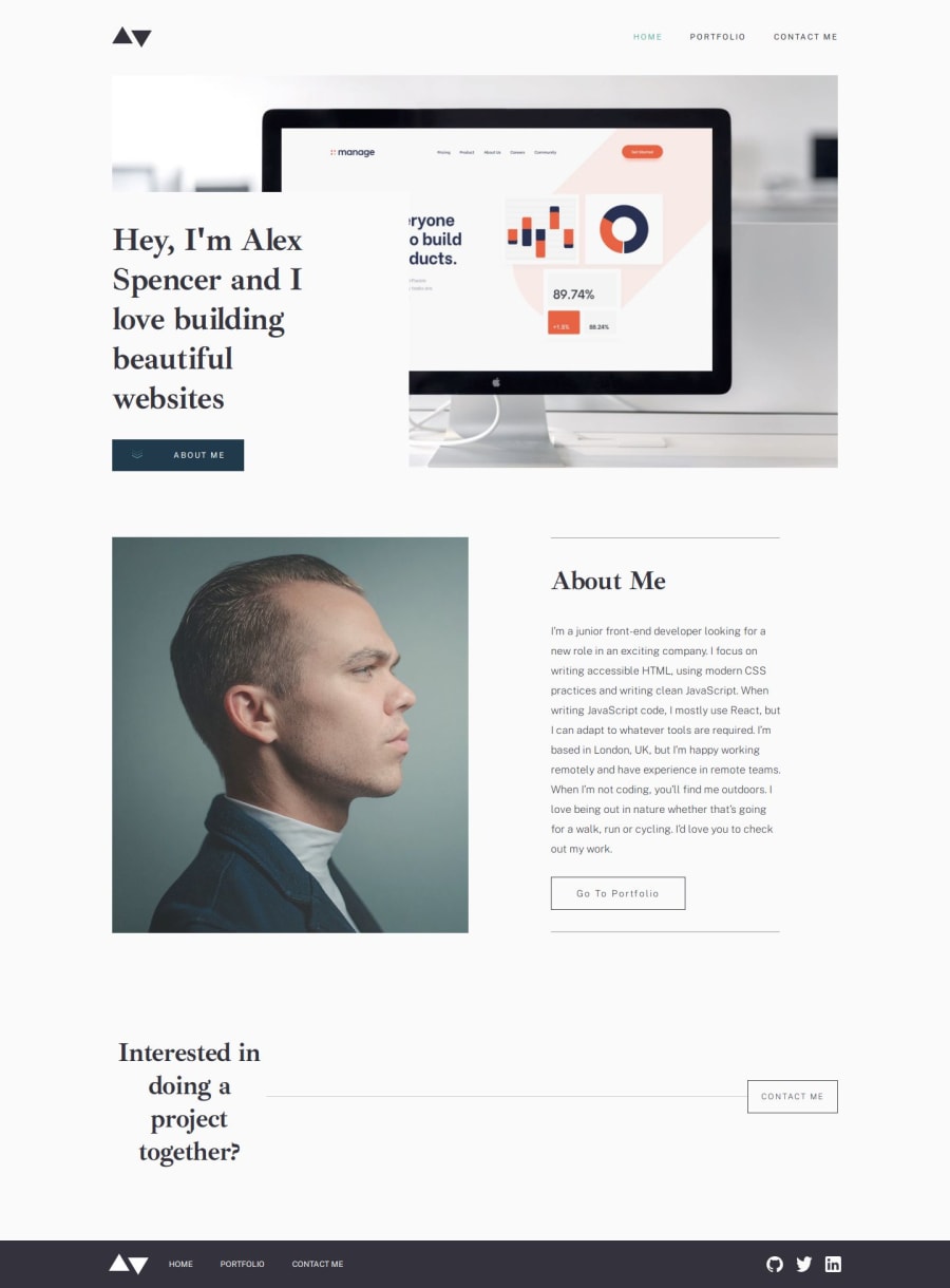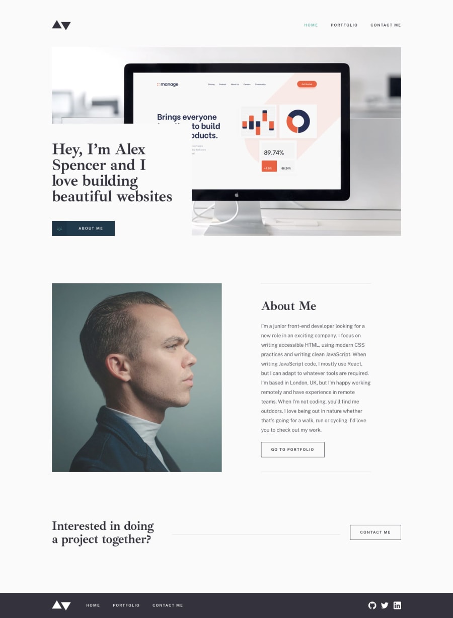
Design comparison
Solution retrospective
Tried vite.
Community feedback
- @kushil9Posted 4 months ago
Also, in your App.css, the use of both @media (max-width: 768px) and (min-width: 376px) and @media (max-width: 376px) is redundant. The reason for this is that CSS follows a cascading algorithm (Importance → Origin → Specificity → Position), where styles defined later in the stylesheet will override earlier ones if they apply to the same element and have the same specificity, assuming they don't come from a different origin or have any importance. Since the second media query (@media (max-width: 376px)) comes after the first, any styles defined for .mainContainer in this second query will take precedence over those in the first query when the viewport width is less than or equal to 376 pixels. Therefore, specifying min-width in the first media query is unnecessary because the styles will always be overridden by the last media query when applicable. To enhance clarity and maintainability, simply simplify the media queries by removing the min-width condition from the first one. This way, you can ensure that your CSS remains clean and easy to understand.
Marked as helpful0@ZoeLong98Posted 3 months agoThanks for your advice! I got what you mean. I’ve been using the same structure in all my CSS files: @media (max-width: 768px) and (min-width: 376px) first, followed by @media (max-width: 376px). The reason for adding extra min-width is that if I don’t overwrite all styles in the second media, the styles from the first one will still apply. But for some CSS, I only want them to work in the specific view.
Do you have a better way to manage this? Or should I plan the styles in advance so that both sections of the responsive code use the same class names and structure, but with different values?
And I checked the website with my phone, it looked terrible🥲 but it was fine in chrome.
0@kushil9Posted 3 months ago@ZoeLong98 There is no right or wrong in CSS. It all comes down to personal preferences. Your current method of structuring media queries—starting with @media (max-width: 768px) and (min-width: 376px) followed by @media (max-width: 376px)—is valid, but it can lead to complications if not all styles are overwritten in the second query. Planning your styles in advance and ensuring that both sections of your responsive code use the same class names and structure but with different values, you create a more organized and scalable css code. I normally go with a desktop-first approach, but you can use either a mobile-first or desktop-first strategy. The most common breakpoints I use to make sites responsive are:
- 576px (Mobile devices)
- 768px (Tablet devices)
- 992px (Large tablet devices and small laptops)
- 1200px (Laptops and small desktops)
- 1400px (Large desktops)
- Above 1400px (Wider screens)
Remember, when writing CSS, there is no right or wrong approach. It ultimately comes down to personal preferences and how scalable you want your code to be.
Marked as helpful0@ZoeLong98Posted 3 months agoGot it! I really appreciate your suggestion! I’ll try to develop my own way of organizing CSS to make it structured and suitable for my needs.
0 - @kushil9Posted 4 months ago
Hey Zeyu! Your minimalist portfolio is absolutely beautiful! I love how clean and organized everything looks :). One little suggestion: it would be fantastic if you could make it fully responsive. Since most web traffic comes from mobile devices these days, ensuring a seamless experience on smaller screens would really elevate your project. Keep up the amazing work!
0
Please log in to post a comment
Log in with GitHubJoin our Discord community
Join thousands of Frontend Mentor community members taking the challenges, sharing resources, helping each other, and chatting about all things front-end!
Join our Discord
