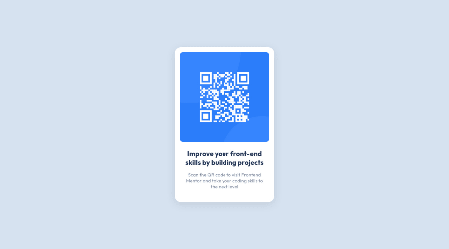
Design comparison
Solution retrospective
Stumbled upon margin collapse. I ran into this problem several times at work, not really questioning it then.
Community feedback
- @Brian-PobPosted about 2 years ago
Hi Rbreckner! Your solution looks great! And thanks for linking that Josh Comeau article. It's definitely an interesting read on margins.
For using padding vs margin, I found this short video that explains the difference really well.
In short, padding is the space between content and its border while margin is the space around the outside of the border.
I struggled with this as well when I started with CSS. But you'll eventually learn the difference as you use CSS more and more. And I think Frontend Mentor is a great tool to learn CSS because it gives you a ton of fun challenges at different difficulty levels. I just wish I started using it sooner!
1@rbrecknerPosted about 2 years ago@Brian-Pob Hey, thank you for the comment.
I already know what the difference is between padding and margin. But the question is when to use what.
I think there are many situations where you could just use both of them. If you check my result, I haven't used a single margin inside the card. As it played out, this solution has very symmetrical padding, which feels quite right.
0@JoshuaMeeksPosted about 2 years ago@rbreckner Padding is for adjusting the element's content and margin is for adjusting the location of the element and the whitespace surrounding it. It can get tricky when you're working on responsive elements but you'll understand it intuitively with practice. Good job on this project.
2
Please log in to post a comment
Log in with GitHubJoin our Discord community
Join thousands of Frontend Mentor community members taking the challenges, sharing resources, helping each other, and chatting about all things front-end!
Join our Discord
