Design comparison
Community feedback
- @HassiaiPosted almost 2 years ago
wrap <div class="attribution"> in a footer tag to fix the accessibility issues.
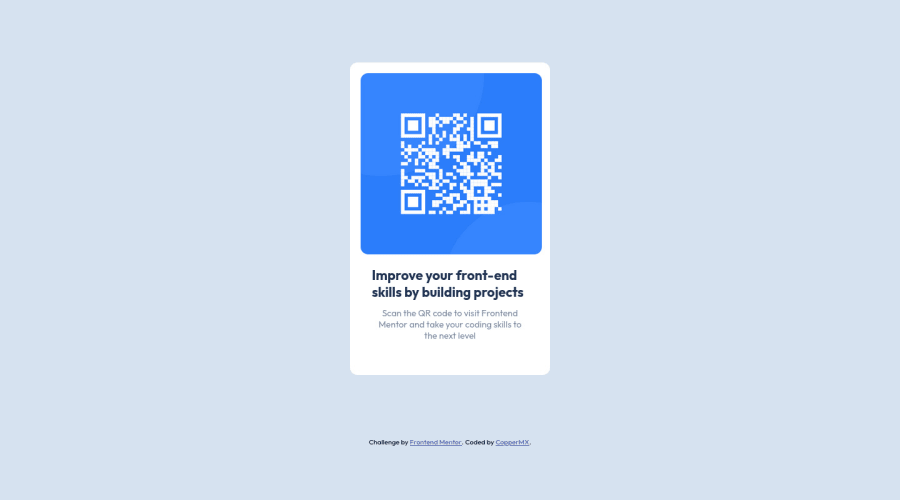
To center .card on the page, add min-height:100vh; display: flex; align-items: center: justify-content: center; or min-height:100vh; display: grid place-items: center to the body.
To center .card on the page using flexbox:
body{
min-height: 100vh;
display: flex;
align-items: center;
justify-content: center;
}
To center .card on the page using grid: body{ min-height: 100vh; display: grid; place-items: center; }Ther is no need to give .card a margin-value and a height value. Give the img a max-width of 100% instead of a width and height value.
Give .card__description a margin value for all the sides, text-align: center and font-size 0.9375rem, this will be the font size of p and h1. give p a margin-top value or h1 a margin-bottom value for the space between the text.
Use relative units like rem or em as unit for the padding, margin, width values and preferably rem for the font-size values, instead of using px which is an absolute unit. For more on CSS units Click here
Hope am helpful.
Well done for completing this challenge. HAPPY CODING
0
Please log in to post a comment
Log in with GitHubJoin our Discord community
Join thousands of Frontend Mentor community members taking the challenges, sharing resources, helping each other, and chatting about all things front-end!
Join our Discord
