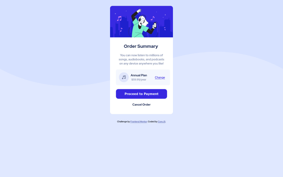
Design comparison
Community feedback
- @HassiaiPosted over 1 year ago
Replace<div class="container">with the main tag,<h2> with <h1> and <div class="attribution"> with the footer tag to fix the accessibility issues. click here for more on web-accessibility and semantic html
Every html must have <h1> to make it accessible. Always begin the heading of the html with <h1> tag wrap the sub-heading of <h1> in <h2> tag, wrap the sub-heading of <h2> in <h3> this continues until <h6>, never skip a level of a heading.
To center .content on the page using flexbox or grid instead of margin, add min-height:100vh; display: flex; align-items: center: justify-content: center; or min-height:100vh; display: grid place-items: center to the body.
USING FLEXBOX:
body{
min-height: 100vh;
display: flex;
align-items: center;
justify-content: center;
}
USING GRID: body{ min-height: 100vh; display: grid; place-items: center; }For a responsive content, there is no need for the height value in .content and .content_desc rather give .content_desc a padding value for all the sides and give .content a fixed max-width value in place of the width.
max-width: 432pxThere is no need to give .content__preview and .content__preview__img a height value and give them a width of 100% instead of a fixed value.
You forgot to give the button a box-shadow value and the design a hover effect.
Use the colors that were given in the styleguide.md found in the zip folder you downloaded. Give the body a background-size of contain.
Use relative units like rem or em as unit for the padding, margin, width values and preferably rem for the font-size values, instead of using px which is an absolute unit. For more on CSS units Click here
Hope am helpful.
Well done for completing this challenge. HAPPY CODING
0
Please log in to post a comment
Log in with GitHubJoin our Discord community
Join thousands of Frontend Mentor community members taking the challenges, sharing resources, helping each other, and chatting about all things front-end!
Join our Discord
