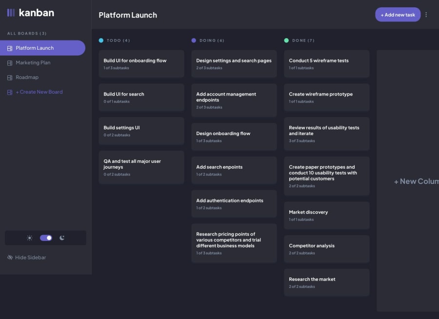
MERN stack w/ Typescript + React Query + Tailwind CSS
Design comparison
Solution retrospective
Well, this one took a while!
I wanted to write all the components for this application from scratch, without relying on component libraries. This presented many challenges, particularly with the extensive use of modals throughout this design.
I also wanted to make the app as accessible as I could, although I still have a lot more work to do in this area. The drag and drop functionality was particularly challenging, despite using an external library (@dnd-kit). The main issue I had was getting this to work nicely with touch devices, since I could not get @dnd-kits 'sensors' API to work as expected.
On the server side, I had a couple of issues pertaining to my database design. I started with defining an array of 'taskIds' on the 'Column' model, then switched to having the identifier on the 'Task' model instead (e.g. 'columnId' field on each Task object). However in the end I found that I needed to combine both approaches in order to effectively write my controllers on the server and optimistic updates on the client. I am not super happy with this approach as it means that there is some duplication of data, which could lead to difficulty in maintaining the database should this app be scaled.
Completing this project has definitely given me some insight into areas that I need to focus on for my continued personal development. Particularly testing, error handling (both client and server) and database design.
Thanks for taking the time to look at this solution, I welcome your questions and any feedback, positive or negative!
Glen
Community feedback
Please log in to post a comment
Log in with GitHubJoin our Discord community
Join thousands of Frontend Mentor community members taking the challenges, sharing resources, helping each other, and chatting about all things front-end!
Join our Discord
