Submitted about 1 year ago
Memory game with React and styled-components
#react#styled-components
@brodiehunt
Design comparison
SolutionDesign
Solution retrospective
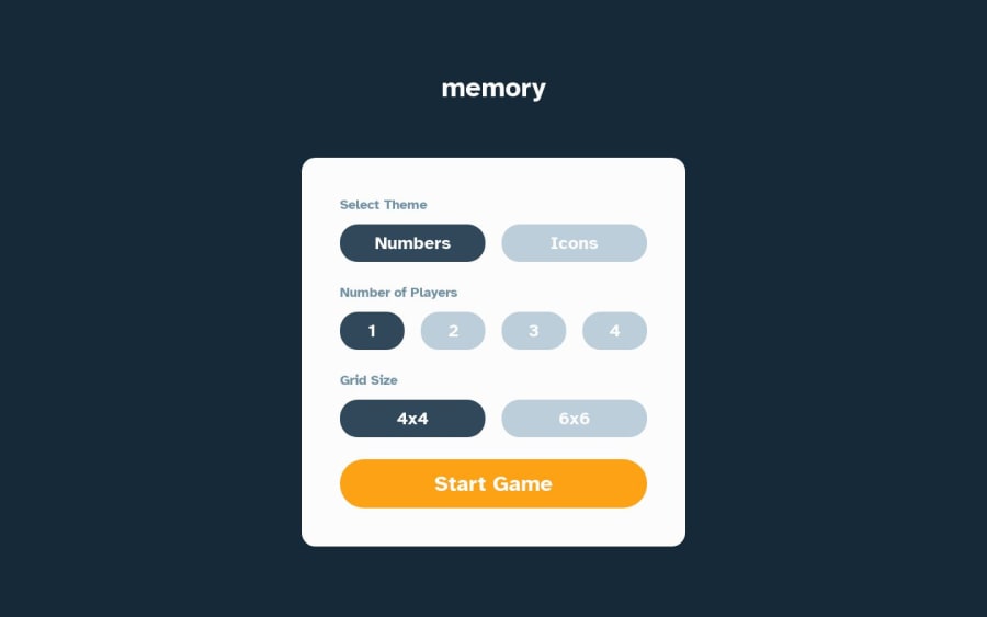
This was my first Advanced challenge and first time trying to use styled components. It took me two days implement from start to finish. I would love some feedback on my project, specifically on the implementation of the styled-component library and css in general. A few things I think I need clarification on.
- Is it best practice to have styled components defined in the file they are used, or defined in their own file and imported into the file they are used.
- What are the actual benefits if you define them in seperate files? Isn't it similar to normal css in this case, only instead of have dynamic classes, you are passing props? But it seems so messy?
- I tried to use css variables as much as I could. For the colors, font-size, border-radius etc. In this project their are 12 or 13 different font-sizes used across screen sizes and different elements. They don't scale relatively based on screen size (from what i could tell), so you are still left defining font-sizes on every element for every screen size, the only difference being its a variable now. It seems only marginally better than just straight up using the measurement from the figma file. What type of system should I be using in these scenarios? Hope you enjoy my project :)
Community feedback
Please log in to post a comment
Log in with GitHubJoin our Discord community
Join thousands of Frontend Mentor community members taking the challenges, sharing resources, helping each other, and chatting about all things front-end!
Join our Discord
