

Design comparison
SolutionDesign

Community feedback
- P@brandontaylor1Posted 3 months ago
Hey i7omic,
So a few things,
-
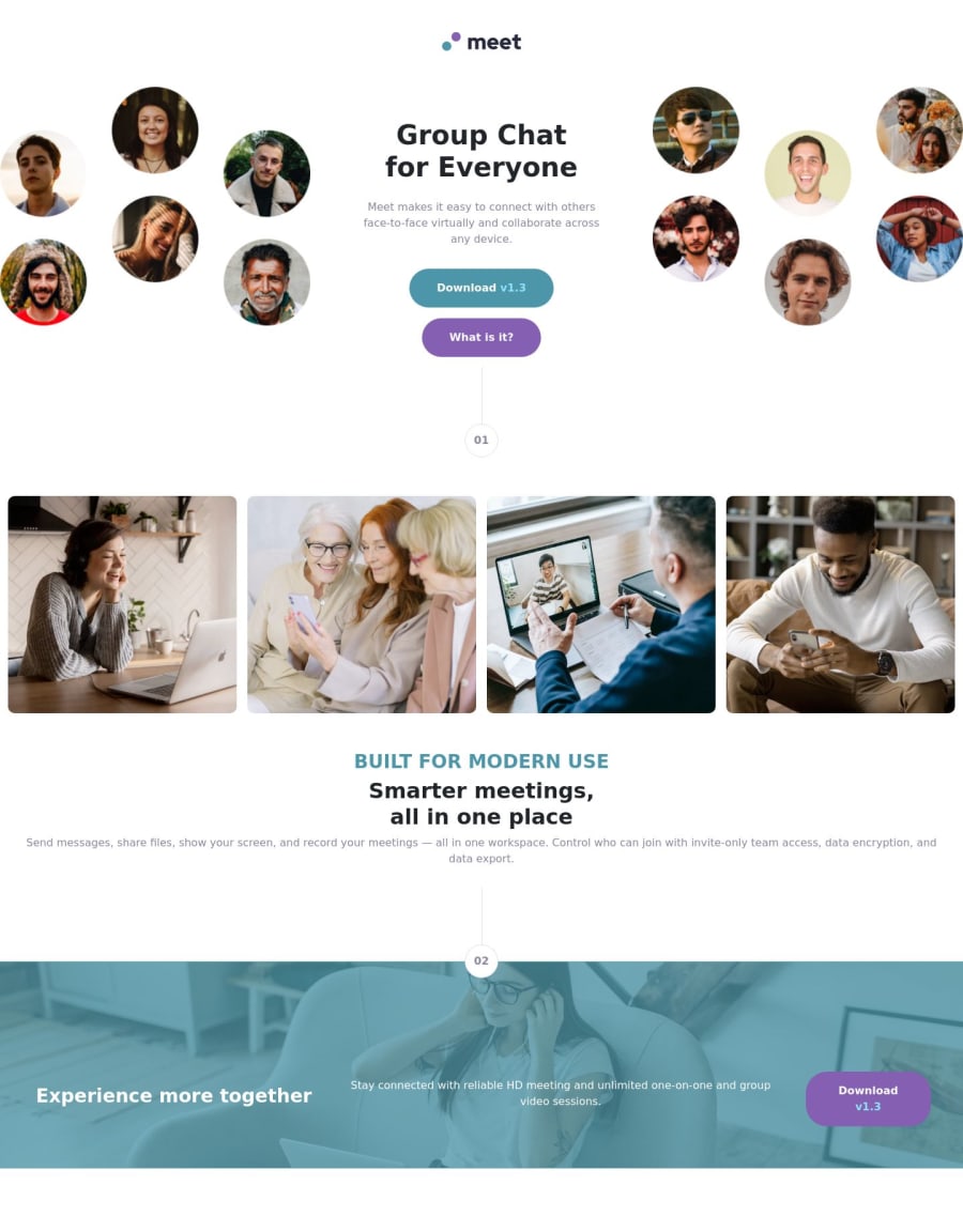
Your buttons need to be aligned side-by-side. To do this, you probably need to wrap a container(div) around the buttons and allow that container to flex the buttons.
-
The text below the images should be shorter for a better user experience. Reading from one end of the screen to another can be a bit tough, so I would wrap another container around that text and minimize the container's width to allow everything to squeeze a little tighter, giving the user a smaller space to read through.
Hope that helps a little bit!
Bt.
0 -

Please log in to post a comment
Log in with GitHubJoin our Discord community
Join thousands of Frontend Mentor community members taking the challenges, sharing resources, helping each other, and chatting about all things front-end!
Join our Discord