

Design comparison

Solution retrospective
I am just proud I did stick with this challenge and finished it. It was quite a hard one for my nerves! :D
A lot of research to finally get something that works, though not perfect yet.
What challenges did you encounter, and how did you overcome them?Main challenges:
-
Section numbers.
-
Having the hero img change with responsiveness and having them to get the good size ratio.
Well, still a lot to learn and practice on responsiveness but I am getting there. Any tool, tricks or ideas / sources to get better in there are welcome!
Community feedback
- @mike15395Posted 9 months ago
@Arnotts33 Congratulations on completing this challenge!
To be honest i have also completed this challenge but my solution is also not perfect, but still i would like to help you with some points that i understood.
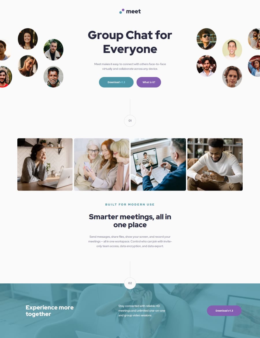
1. First section: hero image is of tablet but displayed on desktop screen. You can easily handle this by writing following code: HTML
 <header>
      <div class="logo">
        <img src="./assets/logo.svg" alt="logo" class="logo-image">
      </div>
      <div class="header-section">


        <div class="image-left-container">
          <img src="./assets/desktop/image-hero-left.png" alt="image-hero-left" class="image-hero-left-desktop">

        </div>
        <img src="./assets/tablet/image-hero.png" alt="image-hero-tablet" class="image-hero-tablet">
        <div class="header-text">
          <div class="main-header-text">Group Chat for Everyone</div>

          <p class="header-paragraph">Meet makes it easy to connect with others face-to-face virtually and collaborate across any device.</p>
          <div class="header-buttons">
            <button class="header-download">Download <span>v1.3</span></button>
            <button class="header-what">What is it?</button>
          </div>
        </div>
        <img src="./assets/desktop/image-hero-right.png" alt="image-hero-right" class="image-hero-right-desktop">

      </div>
CSS
.image-hero-tablet{
    display: none;
}
@media all and (max-width:820px) {
.header-section{
        display: grid;
        grid-template-columns: repeat(1,auto);
        grid-template-rows: auto auto-fill;
        grid-template-areas:
        "hero-image"
        "header-text";

    }
    .image-hero-left-desktop,.image-hero-right-desktop{
      display: none;
    }

    .image-hero-tablet{
        display: block;
        grid-area: hero-image;
        place-self: center;
    }
    .header-text{
        grid-area: header-text;
        width: min-content;
        place-self: center;

    }
    .main-header-text{
        font-size: 52px;
    }

}
2.Using css for stlying 01 and 02 numbers It's good that you have written css for stlying numbers as per design but you can directly export image of it from figma file directly and then use it in
<img></img>. This will save a lot of time writing css.3.code structure: Well written code but can be improved further by deleting unwanted empty files like initial.css in styles folder and updating readme as per template.
I hope above points will improve your solution further.
Keep Learning! Happy Coding:)
0

Please log in to post a comment
Log in with GitHub
Join our Discord community
Join thousands of Frontend Mentor community members taking the challenges, sharing resources, helping each other, and chatting about all things front-end!
Join our Discord