Submitted over 3 years ago
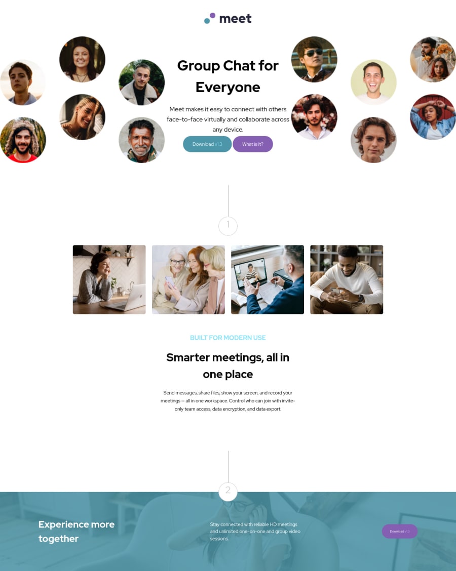
Meeting landing page using mostly flex to arrange items inside body!
@duynguyen0613
Design comparison
SolutionDesign
Solution retrospective
I have a little trouble arranging the header. There is an image of the hero left, right and then header content in the middle. I used flex box order to rearrange them depend on which view the user on (desktop view or mobile view).
Community feedback
- @palgrammingPosted over 3 years ago
you are missing the
:hoverstates on your buttons you seem to have it on the:activestate insteadMarked as helpful0@duynguyen0613Posted over 3 years ago@palgramming oh yeah, I thought the challenge would require an active state of the buttons. But it's not so hard to implement that hover state. Thanks for the feedback! :)) Happy coding
0
Please log in to post a comment
Log in with GitHubJoin our Discord community
Join thousands of Frontend Mentor community members taking the challenges, sharing resources, helping each other, and chatting about all things front-end!
Join our Discord
