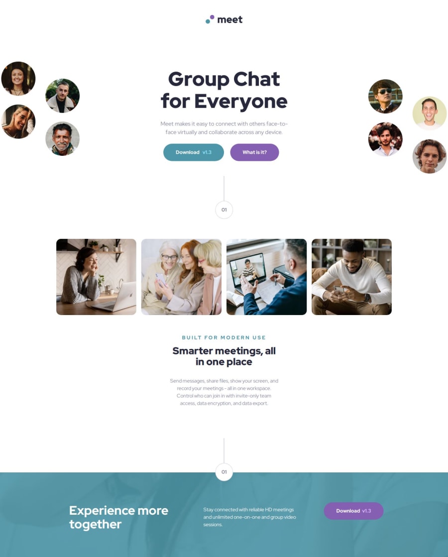


Design comparison

Solution retrospective
This was the biggest project I have done so far with HTML/CSS and I am proud of how responsive I made it, especially as we had different designs for mobile, tablet and desktop.
What challenges did you encounter, and how did you overcome them?I initially had issues with the two images and the header displaying only on desktop, however with the use of flexbox I managed to resolve it.
What specific areas of your project would you like help with?I would like help with my HTML - I think it could be organised better and possibly even adapted better for accessibility/those with screen readers.
Community feedback
- @kaamiikPosted about 1 month ago
Hi. Congratulation for doing this challenge. I wanna mention some notes:
-
The
headeris mostly use for logo and navigation items. Here I suggest you put everything except the logo image inside themain. -
For your buttons, You can simply wrap them in a div and use flexbox with wrap capability. I think It's more clear and clean than using
margin-rightIf you add it for alignment. -
Your
h1and it's text needs a max-width for tablet size. Also the grid images group need need to be on 1 row for tablet as I see in the design. -
And If you notice on desktop you have overflow on the x and you can scroll horizontally and in your footer if you scroll to the right, you can see the background changing. I think this challenge for the top images, need a negative margin and also
overflow: hidden;for x axis. -
Also the blue green section in the bottom seems a footer to me. and can be outside your main as a footer element.
Marked as helpful0@marcus-hillPosted about 1 month agoHi @kaamiik , thanks so much for taking the time to provide feedback on my work. It is very helpful and I have made some necessary changes.
0 -

Please log in to post a comment
Log in with GitHub
Join our Discord community
Join thousands of Frontend Mentor community members taking the challenges, sharing resources, helping each other, and chatting about all things front-end!
Join our Discord