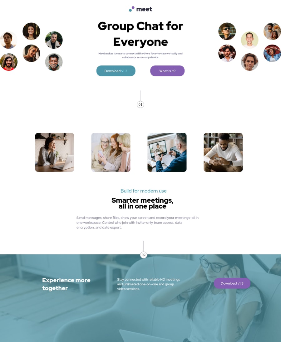
Design comparison
Solution retrospective
During the development of this project, I encountered responsive design issues of the mobile app and the tablet app. I don't understand how to do it right, if anyone can tell me how it works, it would help me for next time, thanks.
Community feedback
- @NADS-PROGRAMMERPosted almost 3 years ago
Hey Brother. So I checked the preview of your site, and whenever I am shrinking down the site, the content is broken.
Since in this challenge, they also give the mobile design. Try to do it in a mobile-first approach.
So for your media queries, you are only using min-width and it makes you enable to have minimum changes when you are growing the page.
I also recommend you to think about what contents are together so you can use flex or grid to it depending on your approach.
I think the only reason why the design is broken is that you are using inconsistent media queries to it. I hope it helps, thanks <3
Marked as helpful0
Please log in to post a comment
Log in with GitHubJoin our Discord community
Join thousands of Frontend Mentor community members taking the challenges, sharing resources, helping each other, and chatting about all things front-end!
Join our Discord
