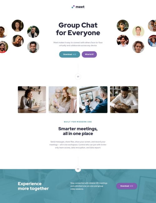
Meet Landing Page with Grid, Flexbox, and Fluid Type

Solution retrospective
I'm happy that after much trial and error my solution is responsive, seems to be working correctly on different browsers and devices, and that I learned new techniques while practicing and reviewing others. I know its only a Newbie challenge, but for me it wasn't easy.
What challenges did you encounter, and how did you overcome them?It was difficult to extend and center the hero image to be wider than the viewport width without causing horizontal scroll. Ultimately, I applied 110vw to the image (wrapped in a picture element) with -5vw margins left and right for mobile and tablet screens. The desktop image is different in that it is 2 image that surround the text, still escaping the bounds of the viewport. Using grid, I set the display to none for the right side image on small screens, and display block when it reaches the desktop width.
What specific areas of your project would you like help with?I would really like to know if my use of and tags is ok for this project. Especially this piece of code in the hero section:
and within the hero I have this ``:
Group Chat for Everyone
Please log in to post a comment
Log in with GitHubCommunity feedback
No feedback yet. Be the first to give feedback on jasoneczek's solution.
Join our Discord community
Join thousands of Frontend Mentor community members taking the challenges, sharing resources, helping each other, and chatting about all things front-end!
Join our Discord