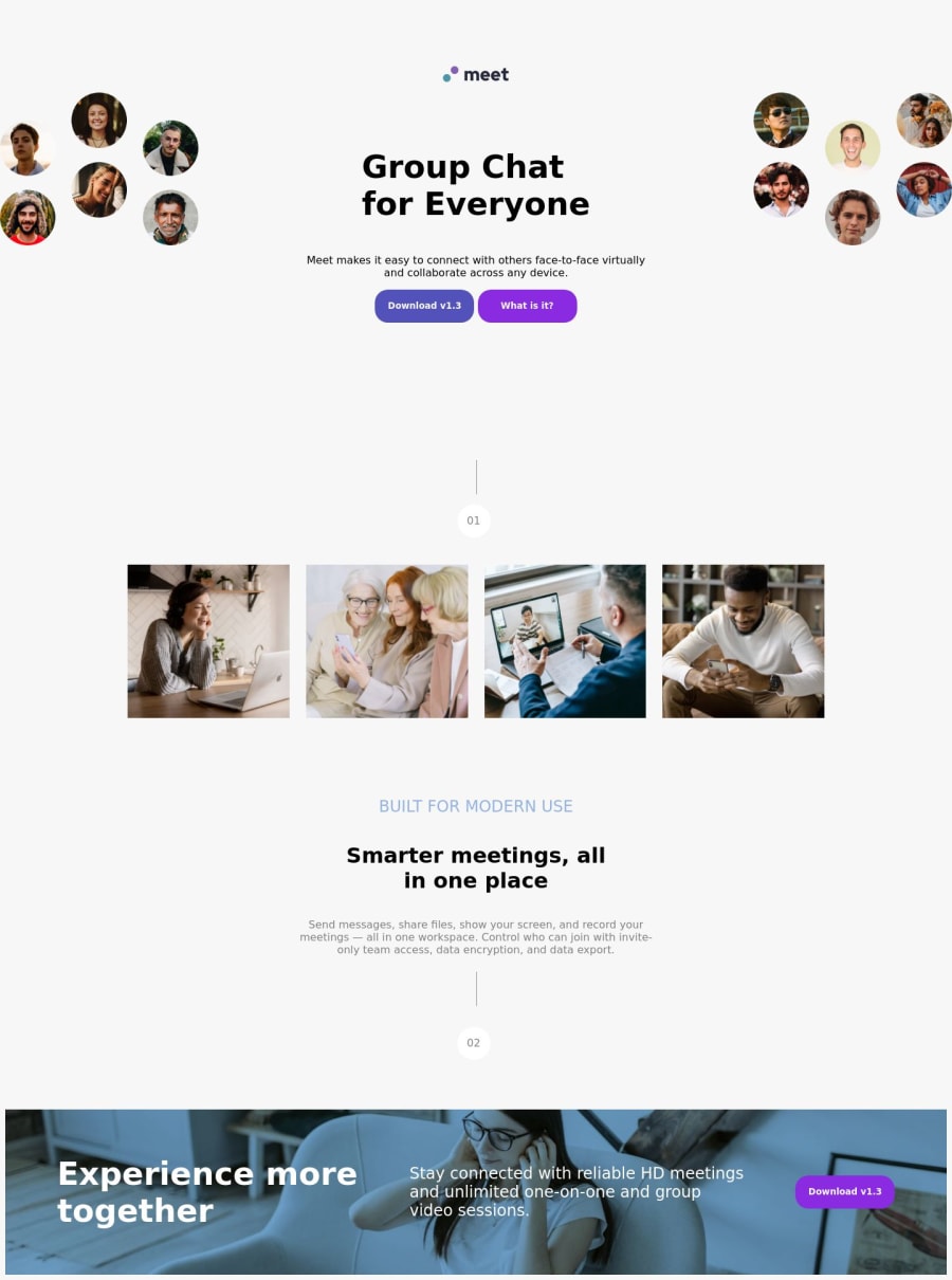
Design comparison
Solution retrospective
I will be glad if you correct me if I am missing something.
Community feedback
- P@TemceoPosted 12 months ago
Hi Tarik
A good effort. A few potential areas for improvement:
-
Please review either the figma or sketch files provided in the challenge. You will be able to get the correct layout at different viewports, font, colours shown in the design - (https://www.frontendmentor.io/learning-paths/building-responsive-layouts--z1qCXVqkD/steps/65eab0bd5acebd40b10dc978/challenge/start)
-
Consider using media queries to better reflect the changes at different viewports. For example there is a single hero image at mobile / tablet view. This transforms to 2 images (left and right side) as you have shown in the desktop view. This article on the use of media queries - (https://developer.mozilla.org/en-US/docs/Web/CSS/CSS_media_queries/Using_media_queries)
-
Consider using css variables for values you use repeatedly. This will save on typing and remembering. See example below:
:root {
  --ff-primary-font: "Red Hat Display", sans-serif;
  --fc-primary: #28283d;
}

html {
  font-family: var(--ff-primary-font);
  color: var(--fc-primary);
}
0 -
Please log in to post a comment
Log in with GitHubJoin our Discord community
Join thousands of Frontend Mentor community members taking the challenges, sharing resources, helping each other, and chatting about all things front-end!
Join our Discord
