Design comparison
Solution retrospective
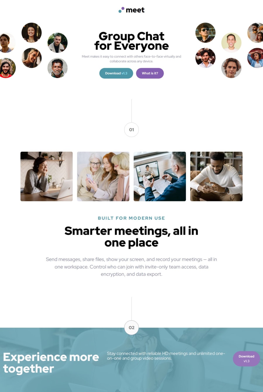
I'm very proud of how I positioned the images around the hero text in the wide desktop layout.
I'm not at all happy with how I built the footer in the wide desktop layout greater than 1024px. I encountered a lot of difficulty in this part of the exercise and couldn't achieve a layout similar to the one requested.
What challenges did you encounter, and how did you overcome them?Positioning the images around the hero text was a bit difficult. Since I had already built the hero, I opted to move it inside a flex container with classes active only beyond the breakpoint. Then, I positioned an image above and one below with display: hidden, allowing me to manage them with flexbox.
Tips on how to build the footer in the wide desktop layout (>1024px): I can't understand where I'm going wrong; I can't seem to center the items on the x-axis. Even the footer button breaks and switches to column mode.
Join our Discord community
Join thousands of Frontend Mentor community members taking the challenges, sharing resources, helping each other, and chatting about all things front-end!
Join our Discord
