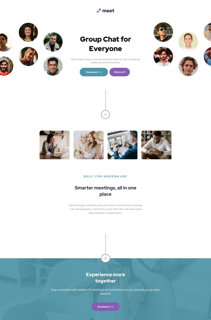
Design comparison
SolutionDesign
Solution retrospective
The challenge was fun and pretty straight forward.
I would say the most challenging part would be getting the hero section's sizing just right. Otherwise, the colour overlay over the footer image was a neat trick to learn as well.
If you have any feedback regarding sizing and making the hero section responsive - let me know!
Community feedback
- @mohammedbahniniPosted 9 months ago
Great solution for this challenge, although I noticed remarks you can improve:
- Use footer tag instead of div with class footer.
- The footer is not like the design for desktop version (I guess you just forgot it).
But I liked the way you combine media-queries and images for the hero section, really good idea.
Have a great journey.
0
Please log in to post a comment
Log in with GitHubJoin our Discord community
Join thousands of Frontend Mentor community members taking the challenges, sharing resources, helping each other, and chatting about all things front-end!
Join our Discord
