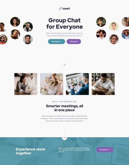
Submitted over 1 year agoA solution to the Meet landing page challenge
Meet landing page w/ Tailwind
tailwind-css
@petrihcour

Solution retrospective
What challenges did you encounter, and how did you overcome them?
I had issues with z-index. I have never fully understood z-index and how to use it, but thankfully this project required a lot of it and I was able to complete the necessary research needed to become more confident in three-dimensional positioning.
Code
Loading...
Please log in to post a comment
Log in with GitHubCommunity feedback
No feedback yet. Be the first to give feedback on Vanessa's solution.
Join our Discord community
Join thousands of Frontend Mentor community members taking the challenges, sharing resources, helping each other, and chatting about all things front-end!
Join our Discord