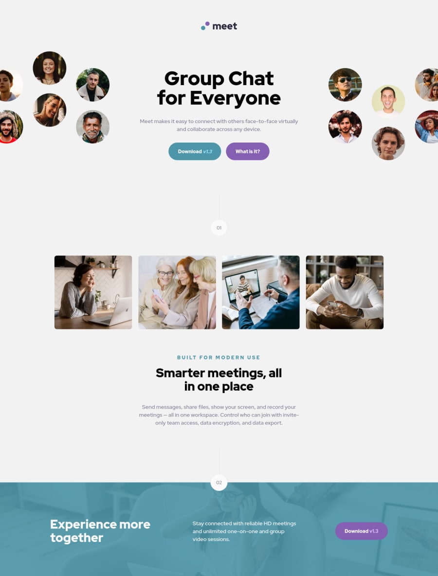
meet landing page Very resposive with HTML, CSS and some animations


Design comparison

Solution retrospective
This project on the instruction part gave me a lot of work to make everything responsive, but I liked the result. I went for an approach that I haven't seen in other projects.
However there were parts that I had to use some divs to organize these my layout, particularly I wish I had not used them, both in the initial images and in the buttons, if you know how I can reduce the amount of divs please let me know.
I wanted to know with you guys about the animations, I used it but it was crazy, I would like to know about organization, accessibility, and time for animations because I'm worried about this interfering with the user's experience.
In the project I used the figma dimensions as a base, but even so I see that there are "crooked" items, I would like to know how I could solve this, without having to keep taking screenshots of the screen comparison. I'm always looking for the pixel perfect.
Any suggestion is welcome, in the last challenge I thought it was good, but the guys showed me several points that I missed, and I managed to learn a lot.
another thing, for accessibility they recommend putting the dimensions of the image in the html, however when I put the dimensions and the page readjusts to be flexible it points as an error, is there any way to put more flexible dimensions in the html
Community feedback
Please log in to post a comment
Log in with GitHub
Join our Discord community
Join thousands of Frontend Mentor community members taking the challenges, sharing resources, helping each other, and chatting about all things front-end!
Join our Discord