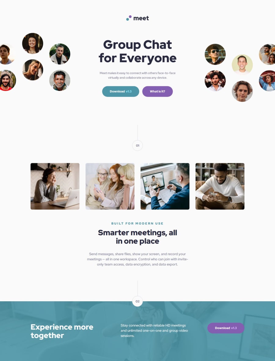
Meet landing page using Vue


Design comparison

Solution retrospective
I was able to change the layout on the different views (mobile, tablet, and desktop). I am especially proud of the hero section, because the elements are arranged differently on desktop which was tricky.
What challenges did you encounter, and how did you overcome them?On desktop and tablet, the text-content element inside the hero section is exactly 448.3px wide in the Figma mockup.
That's really confusing to me. It took me really long to find a solution on how to structure the hero layout on desktop. I decided to create the following grid layout:
grid-template-columns: 1fr auto 1fr;
The width of the center column is set to 28rem (448px).
The hero images are placed in the left and right column and are moved by an offset with transform: translateX();
I would like help with the hero section on desktop. It was really challenging to find a solution.
- Why is the
text-contentelement inside the hero section exactly448.3pxwide. What element/constraint is the width based on? - How did you create the hero section on desktop, do you have any tips?
Community feedback
- P@JomagenePosted 8 months ago
Hi MichaHuhn,
Great job on the meet-landing-page! Your design looks fantastic. I noticed a few areas where you might simplify things:
-
Grid Layout: I see you've used
grid-template-columns: 1fr auto 1frwithtransform: translateX();for positioning. In my experience, Flexbox can simplify this kind of alignment, making it easier to center and adjust elements naturally. For example, I used that fixed width as a max-width of the text-content beside the two images: left and right. All content are justified space-between which gives a more flexible layout. To handle responsiveness, a flex-direction column is sufficient to have the work done. -
Layout Complexity: While your grid-based layout works, it might be more flexible and maintainable with a Flexbox. This could reduce the need for transformations.
Overall, your work is impressive! A few small adjustments could make your design even stronger. Have you tried experimenting with Flexbox for layouts like this? I'd love to hear your thoughts.
Best,
Jomagene0P@MichaHuhnPosted 8 months ago@Jomagene Hi, thank you for your answer! That's a good idea to use
justify-content: space-between;. On smaller desktop screen sizes (1450px), the images should overflow the screen on the left and right. How did you create this effect while keeping this 3 column flex/grid layout?0P@JomagenePosted 7 months agoHi @MichaHuhn, It depends on the approach you take. Here's how I handled it:
-
Limit Body Width: I set the body
max-widthto 1440px to control the overall width. -
Positioning Images: The images are positioned absolutely, with
leftfor the left image andrightfor the right image. This allows the images to overflow the screen while keeping them aligned to their respective sides. -
Container Width: I set a specific width for the image containers. However, instead of giving the text content a fixed width, I used
max-width. As the screen width decreases, the space between the images decreases first, and then the text content width decreases accordingly. -
Media Query for Adjustments: Before the layout becomes awkward with
flex-direction: row, I used a media query to adjust the layout.
Here's an example of the code:
<figure class="hero-left"> <img src="./assets/desktop/image-hero-left.png" alt="image hero left" /> </figure> <figure class="hero-img"> <img src="./assets/tablet/image-hero.png" alt="image hero" /> </figure>.hero-left, .hero-right { position: relative; img { position: absolute; } } .hero-left, .hero-right { display: block; width: 24.625rem; } .hero-left img { left: -1.62rem; top: 0; } .hero-right img { right: -1.62rem; top: 3.5rem; }This approach maintains the layout across different screen sizes and ensures the images overflow correctly while keeping the text content responsive. My solution (here)[https://www.frontendmentor.io/solutions/meet-landing-page-using-sassscss-flexbox-and-media-queries-xdq8mZXkJW]
Best,
JomageneMarked as helpful1 -

Please log in to post a comment
Log in with GitHub
Join our Discord community
Join thousands of Frontend Mentor community members taking the challenges, sharing resources, helping each other, and chatting about all things front-end!
Join our Discord