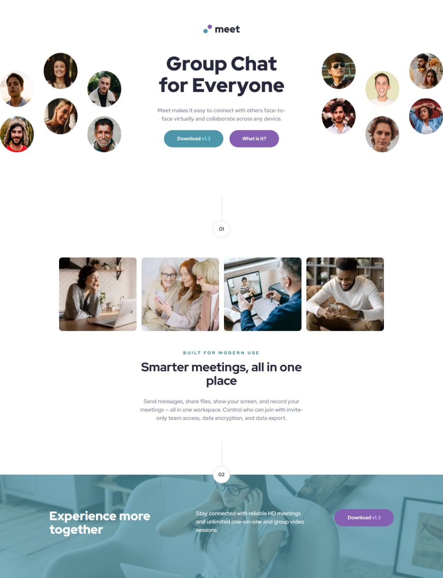
Design comparison
Solution retrospective
I am very proud of this project because the previous ones were just a part of the site and now I was building the whole home page with header, main and footer sections. It was the biggest challenge so far but I managed to adapt the page to all resolutions from the design.
Next time I will take care of better class naming, html structure to make it easier to style.
What challenges did you encounter, and how did you overcome them?The biggest challenge was adapting the project to all resolutions, setting the footer to be covered with color and those shapes at numbers 1 and 2. But after a few attempts I managed to handle all of these things.
What specific areas of your project would you like help with?I would like to ask you to check the code for readability and code duplication. Check responsiveness on different resolutions and give me tips on what I can improve.
Community feedback
Please log in to post a comment
Log in with GitHubJoin our Discord community
Join thousands of Frontend Mentor community members taking the challenges, sharing resources, helping each other, and chatting about all things front-end!
Join our Discord
