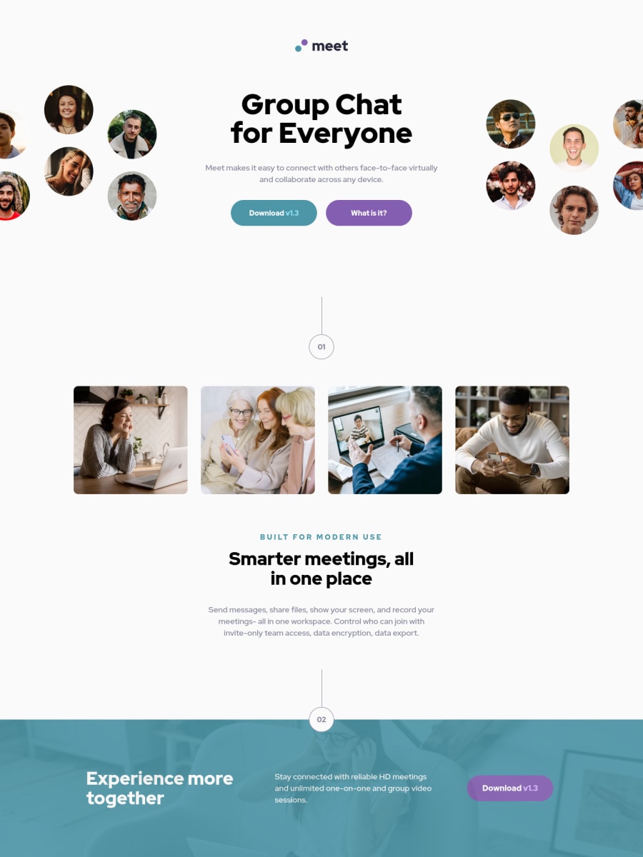
Design comparison
SolutionDesign
Solution retrospective
Hello Everyone, I've just completed this Meet Landing Page Challenge from Frontend Mentor. Please kindly give any feedbacks. Thankyou
Community feedback
- @ApplePieGiraffePosted over 2 years ago
Hi there, Michael Tze! 👋
Great job on this challenge! 👏
A few things I'd like to suggest are,
- Making sure that all of the content of your page is contained within the header, main, or footer elements (there shouldn't really be content outside those elements).
- Making sure to add a heading element inside every
section
tag that you use (see your solution report). If there is no visible heading in the design, you might need to add one anyway, but hide it visually with CSS, or choose a different element altogether. - Adding a favicon to the site. There should be one in the starter files for this challenge that you can use.
- Perhaps looking into using a preprocessor such as Sass. It'll add superpowers to your CSS (through features like nesting and functions) which will help reduce the number of styles you have and make writing and organizing CSS a little easier (or much easier for large projects). Might be something that helps you in the future! 😉
Hope you find these tips helpful. 😊
Keep coding (and happy coding, too)! 😁
Marked as helpful2@Biggboss7Posted over 2 years ago@ApplePieGiraffe Thankyou very much on your feedback :)
1@ApplePieGiraffePosted over 2 years ago@Biggboss7
No problem! Happy to help! 😊
0
Please log in to post a comment
Log in with GitHubJoin our Discord community
Join thousands of Frontend Mentor community members taking the challenges, sharing resources, helping each other, and chatting about all things front-end!
Join our Discord