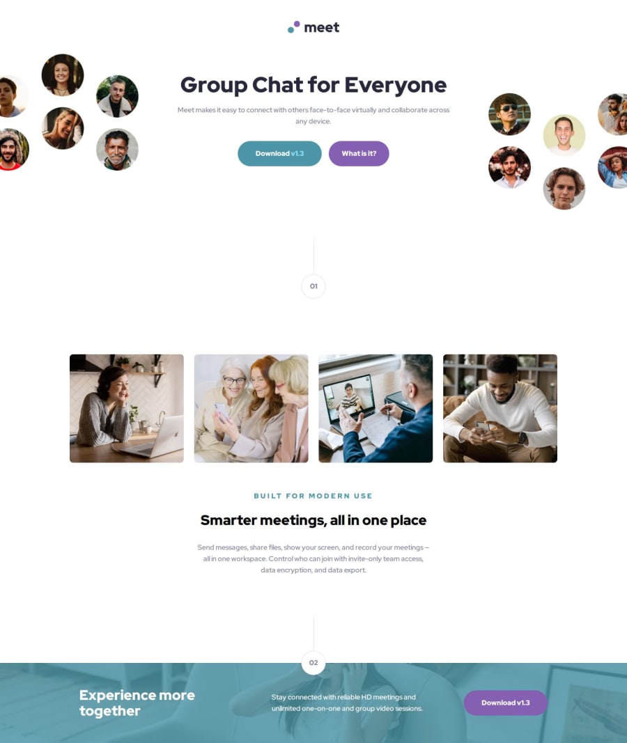
Design comparison
Solution retrospective
I'm most proud of being able to create it responsively, and I would do it desktop first next time. Mobile first workflow was... weird. IDK. Probably it's skill issue.
I had to meddle a lot with the css to make it look like what I wanted to do, especially with regards to the cut header picture. I also had to manually set up where the picture should be (if you notice the header, one of them is located above and the other is below). It's hard enough!
What challenges did you encounter, and how did you overcome them?I have to determine the margin for the picture in order for it to be out of page. That's hard. And I'm not that good at CSS, so I have to fiddle a lot with the containers, etc. I also have to put the circle on top of the picture in the footer, and that's also hard. I managed to do it by again - fiddling with it a lot. I learnt about negative margin, and yeah I played with it.
In order to put a green overlay, I had to use a ::before attribute for the picture. That's new for me (and I have to set the z-index as well).
What specific areas of your project would you like help with?How would you simplify this? I feel like this could be done in way less lines...
Community feedback
Please log in to post a comment
Log in with GitHubJoin our Discord community
Join thousands of Frontend Mentor community members taking the challenges, sharing resources, helping each other, and chatting about all things front-end!
Join our Discord
